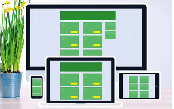
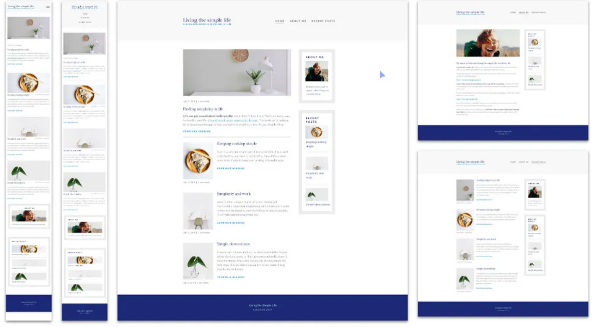
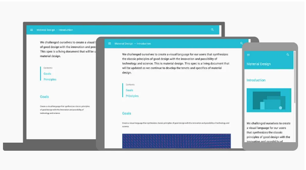
Responsive web design isn’t just a nice-to-have anymore—it’s a must for any modern website. The good news? Implementing RWD is easier than ever, thanks to tons of great tools that help you build, test, and polish designs to create top-notch user experiences.
Below is our roundup of some of the best resources to help you make sure your website works seamlessly and looks sharp on any device. Need more useful tools? Check out our guides to the best website builders and web hosting services. We also have a curated list of web design tips to level up your work. And if secure file storage is a concern, these top-tier cloud storage options have you covered.
01. How to Start Thinking Responsively
Over on FreeCodeCamp, Kevin Powell hammers home a key point: responsive web design isn’t a passing trend—it’s the standard for how websites should be built. That means you need to prioritize responsive thinking from day one. In this post, he walks you through getting into that responsive mindset while building a fully functional 3-page responsive website.
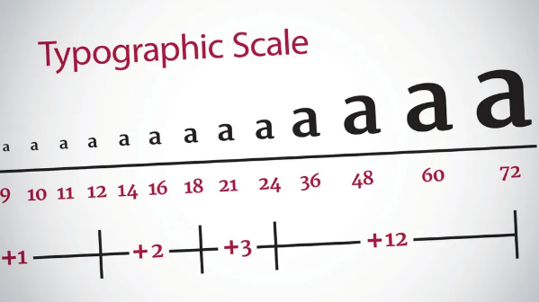
02. 9 Tips for Responsive Typography
Responsive web design naturally calls for responsive typography—but what exactly does that entail, and how do you put it into practice? We asked seven leading web designers to share their insights on crafting elegant, easy-to-read text that works across every viewport size.
03. The Rules of Responsive Web Typography
Responsive typography is tricky—it requires both design skill and technical know-how. But cutting corners isn’t an option; typography is the backbone of web design. This guide breaks down the design principles and practical solutions you need to get it right.
04. Design a Responsive Site with Em-Based Sizing
Using em units for font sizes lets you build page components that adjust automatically if the font size changes. Then, with a clever hack for responsive font sizing, you can create an entire page that adapts dynamically to your browser’s viewport width. Follow this tutorial to learn how to tap into the “relative” nature of ems for scalable, responsive designs.

05. Priority Guides: A Content-First Alternative to Wireframes
Wireframes are the go-to tool for designing websites, apps, and other digital interfaces—but they have drawbacks, especially when it comes to responsive design. Here, Heleen van Nues and Lennart Overkamp introduce their preferred alternative: priority guides. These include content and elements for mobile screens, organized by priority from top to bottom—no layout rules included.

06. The Pro’s Guide to Responsive Web Design
Written by Justin Avery (curator of the Responsive Design Weekly newsletter), this guide from net magazine takes web professionals through the basics of RWD all the way to more advanced techniques.
07. How to Design Responsive, Device-Agnostic Forms
Forms are one of the most critical elements in any digital product design—whether you need a signup flow or a multi-step stepper. The key? Designing them to work just as well on mobile as they do on desktop. This tutorial shows you how, with handy tips for using Flexbox.

08. Create a Responsive Layout with CSS Grid
Browser support for CSS Grid Layout gets better every day. It’s not a replacement for Flexbox or even floats—but when used alongside them, it’s a fantastic way to build fresh, engaging responsive layouts. Follow this step-by-step guide to build a responsive portfolio site using Grid.

09. The Web Designer’s Guide to Flexbox
Have you started using Flexbox yet? In this tutorial, Wes Bos breaks down the core concepts you need to master this powerful tool, giving you a solid foundation to work with.

10. Codrops Flexbox Reference
Sara Soueidan—known for breaking down complex ideas in an approachable way, without skipping over important details—wrote this complete Flexbox guide. The Codrops team updates it regularly, making it a resource you’ll want to come back to again and again.
11. Stacks: Flexbox for Sketch
Stacks (part of the Auto Layout plugin) lets you use Flexbox technology in Sketch—no CSS required. This article explains how to leverage this powerful technique to simplify responsive design in your Sketch workflow.
12. A Crash Course in Technical RWD
On the Treehouse blog, Jerry Cao packs a ton of useful info into a short, easy-to-read article. It’s the perfect quick primer for anyone looking to brush up on the technical side of responsive web design.

13. Create Flexible Layouts with Susy and Breakpoint
If you don’t want to use a framework for your responsive site, these Sass extensions are a great alternative—each has its own strengths. They handle the math behind responsive design for you, so you can focus on the creative part.
14. How to Create Responsive Guides in Adobe XD
Curious about Adobe Experience Design (XD)? This tutorial is a great starting point—it includes a video demo that walks you through every click of the process.
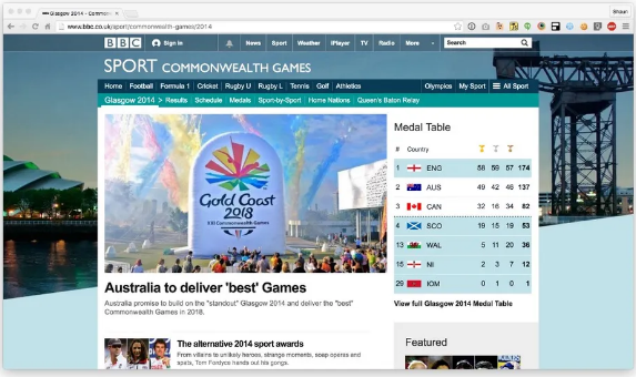
15. CSS at BBC Sport
This isn’t a traditional tutorial, but it’s packed with valuable lessons. In the first post of a two-part series, frontend developer Shaun Bent gives a detailed look at how BBC Sport handles CSS. They’ve kept the CSS foundation for this massive site under 9KB—and it’s fascinating to see how they pulled that off.
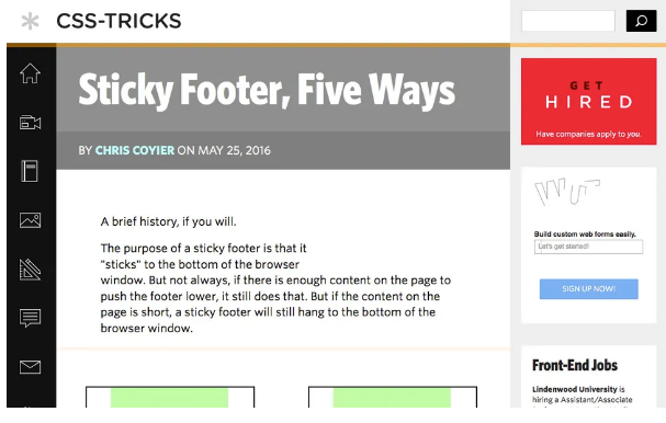
16. Sticky Footer: Five Ways
A sticky footer sounds simple enough, right? Unfortunately, it’s trickier than it seems to get that footer in the right spot on every device. Luckily, Chris Coyier shares five methods to make it work—using calc(), Flexbox, negative margins, and Grid.
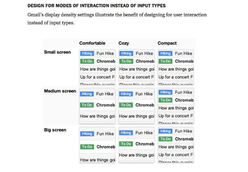
17. Adapting to Input
Responsive design isn’t just about making your page look good on any device—it’s also about making it work well. That means optimizing for input in a world where desktops have touchscreens and phones connect to keyboards. Jason Grigsby of Cloud Four shares smart advice in this article.
18. How Our Best Practices Are Hurting Mobile Web Performance
Some “best practices” from the desktop era can hurt mobile performance if you apply them without thinking. This article challenges you to rethink how you optimize your site for mobile, encouraging deeper consideration of what truly works for smaller screens.
19. How to Build Responsive Web Apps with Container Queries
Learn how to adapt a sleek, complex web app—complete with components, states, and interactions—across different sizes and resolutions using container queries.