
Mobile web design experts Anna Dahlström, Dean Evans, and Sam Hampton-Smith are sharing their top advice for anyone working on mobile-focused web pages.
In recent years, mobile design has boomed—but figuring out what to do and where to start can be tricky. Mobile web design isn’t just about choosing between a mobile site or an app; there are plenty of middle-ground options and key factors to consider. To help you out, we’ve rounded up 30 essential tips for defining your mobile strategy and designing for mobile.
Note that our focus is on mobile web design (and, to a lesser degree, app design)—not responsive websites. If you’re interested in responsive design, check out our article on how to build an app and our roundup of responsive web design tutorials. You can also explore our selection of CSS and JavaScript tutorials.
01. Think ahead: Define your goals now and for the future
Mobile web design evolves fast, and new technologies and devices pop up all the time. Think about it: the first iPad launched in summer 2010, and the Apple Watch in 2015—so it’s safe to say things will look very different in just two years.
Build solutions that can evolve in a year or two, rather than requiring a full redesign. Define your immediate mobile needs and your long-term goals, and weigh the pros and cons of building an app versus investing in a cross-device-compatible site.

02. Know your target audience and their devices
Understanding which devices your audience uses to view your mobile site is critical for shaping both your design process and overall mobile strategy. While many people have smartphones, don’t assume everyone does—or that they all use iPhones or Android devices. Instead, use analytics or research to find out exactly what devices your target audience relies on.
Also consider how your audience uses their phones (and for what purposes) and whether they have a reliable internet connection. The latter is especially important if, for example, your users will be filling out forms on their mobile devices.
03. Understand mobile usage and behavior patterns
There are plenty of myths about mobile usage that can lead to poor design choices. One of the most common? The idea that mobile users are always in a hurry or only care about specific things when using their phones.
In reality, a lot of mobile web use happens when people have downtime—like sitting on the couch at home—and that changes how you should approach design.
Base your decisions on the fact that users are increasingly using phones for the same tasks they do on desktops (this is already happening). Whenever possible, research your specific audience to confirm what’s true for them.

04. Understand tasks and context
In the early days of mobile, there was a stronger link between tasks and context. Device limitations and how we accessed the internet on mobile meant tasks were pretty narrow—if someone visited your site on a phone, you could assume they were on the go and looking for something specific.
Today, mobile devices are used everywhere, and more and more for the same tasks as desktops. Context still matters, but it’s about how a user’s surroundings affect their experience—not that a specific context equals a set list of tasks.
05. Avoid custom mobile sites when possible
So how do you decide what to build for your mobile presence? Sometimes, limitations with tools like your CMS make a custom mobile site necessary. But whenever you can, skip separate mobile sites. In the long run, they’re more expensive and time-consuming to maintain—especially if you need custom versions for different devices.
Building a solution that works across as many devices as possible lets you focus your resources and budget on content, not maintenance.
06. Keep core content consistent
Since users are increasingly using mobile for the same tasks as desktops, they expect a seamless, consistent experience across devices. That’s why your mobile site should mirror your desktop version in terms of core content.
People often click the “desktop version” link—especially if they’re given a limited mobile site or one that’s drastically different in structure or design from what they’re used to. Keep core content the same, and think about how users move between devices and what that means for their experience.

07. Optimize for mobile
Keeping core content consistent doesn’t mean you shouldn’t optimize your mobile site—quite the opposite. You should optimize content display, tweak interactions for better touch functionality, and leverage built-in device features.
Mobile offers unique opportunities to create more tailored, engaging experiences than desktop—and you can do this without building a custom mobile site or app.
08. Use entry points to decide if you need an app
Apps are great for focused, personalized experiences. If you’re thinking about adding an app to your mobile strategy, start with analytics and entry points. If most users come via direct traffic, it might mean they bookmark your site—so an app icon on their home screen could add value. But if most traffic comes from shared links, an app alone won’t work: people need to access your content even if they haven’t installed the app.

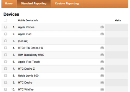
09. Use analytics to prioritize devices
Analytics also help you decide which devices to focus on—whether by operating system, version, or screen size. For example, Google Analytics shows a breakdown of devices used, the split between operating systems, and which versions of each OS are most common.
10. Consider different types of apps
If you’ve decided you need an app, figure out which type is right for you. Native apps (like Instagram) are built for specific operating systems. They usually offer the most device-optimized experience but require maintaining separate codebases.
Hybrid apps (like Facebook) are built with HTML5 and JavaScript, using a “wrapper” to add native features. This means fewer versions to maintain, but it can take time to get the functionality to feel “app-like.” Your choice depends on your goals, budget, and how often you need to update content.
11. Follow UI guidelines and patterns
Every operating system has UI and interaction rules that users are familiar with. If you’re building an Android app, don’t just reuse your iOS app design—optimize it. Android and iOS are different, and learning those differences while following their guidelines will make your app easier to use.
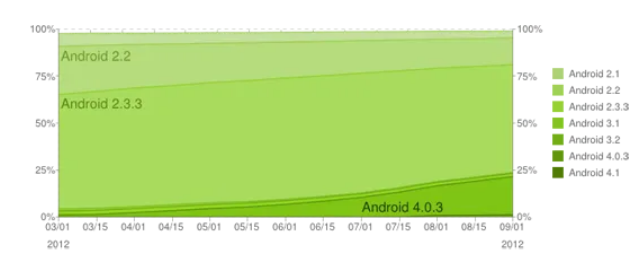
12. Account for backwards compatibility and fragmentation
App design isn’t just about iOS vs. Android. Each OS has multiple versions, and not all users will have the latest one. iOS users adopt new versions quickly, but Android adoption is slower—leading to more “fragmentation” (many versions in use). Don’t just design for the latest versions; make sure you cover the versions your target audience actually uses.
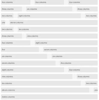
13. Define your grid and breakpoints
For responsive design, your grid and breakpoints are the foundation of your mobile site. There are tools to help you set the number of columns, their width, and gutters—and guide how they work on mobile and smaller screens. Sometimes a fixed width works best; other times, a fluid approach (or a mix) is better.
Breakpoints are the screen resolutions where your content layout changes. Together, your grid and breakpoints keep your site modular and responsive.
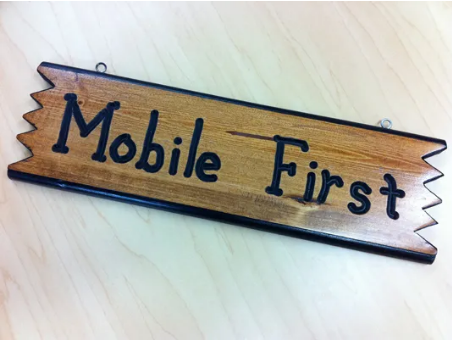
14. Mobile-first or desktop-first: Start where it works for you
Designing mobile-first is still a hot topic. Some designers prefer it; others don’t. Like most things in design, there’s no one “right” way.
The key is to focus on content and keep smaller screens in mind. Whether you sketch mobile designs as you go while refining desktop first, or start with mobile, it doesn’t matter—so long as you’re thinking about your content, why it’s there, and how it works across devices. Start where you’re comfortable, but don’t be afraid to try both approaches.
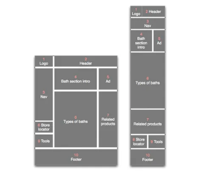
15. Define your content stacking strategy
If you don’t plan how content modules in columns will behave on smaller screens, the left column will stack first (at the top), followed by the middle, then the right. This rarely matches the importance of individual modules.
To ensure content displays correctly from desktop to mobile (or vice versa), define how modules will stack and reorder. Start with a simple numbering system: sketch how content changes layout, share it with your team, and work through adjustments. Have developers prototype it, then refine as needed.
16. Don’t overlook navigation
Navigation is often ignored in responsive design—but it’s getting more attention now. Brad Frost has written excellent posts outlining different mobile navigation options, along with their pros and cons. Read those, then define how navigation will work on your mobile site—don’t leave it up to developers to decide.
17. Don’t be afraid to challenge the status quo
The web is full of great pattern libraries and tutorials. Learn from them and draw inspiration—but don’t be scared to try something new or question existing norms. Established patterns are helpful, but pushing boundaries drives progress. And in mobile design, things move fast—fresh ideas matter.

18. Not every page/screen needs a wireframe or design
It’s easy to fall into the trap of defining every detail. But you don’t need wireframes or designs for every page, screen size, or orientation. Use analytics to focus on high-priority areas, collaborate closely with dev and design teams, and find a level of detail that works for your project. For example, skip wireframes for every screen size—use a master set plus quick sketches for the rest.

19. Collaborate across teams
To get the best mobile design (and design in general), teams need to work closely together. Many problems only surface when wireframes become designs, or designs become code. The more you collaborate, the sooner you’ll spot issues and find solutions.

20. Prototype, test, and iterate
The most important part of mobile design is prototyping and iterating as you go. Work closely with developers to make sure your ideas actually work when built—and to identify areas that need more detail. Put together a testable version, get feedback from potential users, and refine. That’s what ultimately leads to a great design.

21. Deliver content quickly
The best mobile sites are clean and straightforward. Figure out what your visitors expect to see: ask clients what’s essential, and think about what users need to access fast (like a restaurant’s menu, reservation info, or location map).
22. Limit navigation layers
Stick to a maximum of three navigation layers for your mobile site—some designers aim for just two. Mobile users want info fast; they won’t tap through multiple layers to find what they need.
23. Design from the user’s perspective
Learn to use your design on a real device—just like a user would. Test it yourself, and have clients test it too. This helps you spot unnecessary info or gaps. User testing is always critical here.

24. Choose the right web font
Serif fonts are okay only if they’re sharp and easy to read, but mobiles are advanced enough now that you can get creative with typography (and embed fonts). Still, keep things simple for users. For more tips, check out our article on responsive typography.
25. Don’t overcomplicate device differences
You need to remember that not everyone uses the same device (for example, not all smartphones have touchscreens), but mobile tech is pretty similar across devices. Keep in mind that screen resolutions and input methods vary—but don’t obsess over it. If your content is valuable, people will want to access it, no matter how their device renders your design.
26. Test, test, test (across devices)
There are so many platforms that testing every smartphone and OS combination is impossible. New Android devices launch almost weekly, plus there’s Windows Mobile, iOS, BlackBerry OS, and Cyanogen OS. But you do need to test across a sample of devices—and make testing an ongoing, iterative process. Nothing’s worse than designing only for iOS, then realizing Android devices don’t render your page correctly after launch.
27. Consider battery life
It might seem odd to worry about battery life when designing a mobile site, but users will appreciate it. Smartphones and tablets have small batteries and powerful processors—more processor use means faster battery drain. This is especially true for features like HTML5 geolocation or complex canvas animations, so use those sparingly.
28. Accept and embrace limitations
It’s tempting to cram every feature into a mobile site, but some things work better on desktops. On the flip side, mobile devices excel at other tasks: location-aware content, for example, is perfect for mobile, but rendering WebGL is still better left to desktops (for now).
29. Minimize text input
Most phones and tablets let users type a few sentences easily—but it’s not a great experience. On touchscreens, the virtual keyboard covers part of the web content, which is disruptive. To reduce frustration, cut down on text input in forms. When input is necessary, be practical: no one will type a 2,000-word essay into Safari on an iPhone.
30. Embrace the pace of change
One of the best things about smartphone tech is how fast platforms evolve. Techniques that didn’t work 6 or 12 months ago are now totally feasible. The downside? Code you write today might not work in a year—especially if you’re using cutting-edge tools. Make sure your client understands this reality.