
Gene Crawford breaks down key principles for any responsive strategy and highlights five websites that execute it flawlessly.
Responsive web design is hands down the most effective way to get a company’s website ready for the mobile market. There are several approaches to building a responsive site: “mobile first,” “content first,” retrofitting an existing site to be responsive, and perhaps the most common—“powering through it” to meet deadlines.
In most web design projects that include responsive work, you may not have the budget to execute it the ideal way. Often, you’re just trying to squeeze a functional mobile view into the project by any means necessary. If you’re in this spot, there are simple guidelines you can follow for the mobile or small-screen portion of your responsive design to make the shift from desktop smoother.
Simplify—Above All Else
- Limiting the number of visible features streamlines design elements, making the site easier to scan and tap. Prioritize larger touch targets so users don’t need pinpoint accuracy to navigate.
- Mobile load times are always slower than desktop, so “strong information scent”—clear cues for what users will find—matters far more on small screens. Users want to land on the right link immediately instead of bouncing between pages. Achieve this with full-length headlines or more descriptive microcopy on navigation items and buttons.
- If you collapse navigation into a smaller space or link to a navigation section (like the footer), clearly mark the link or interaction as navigation with a recognizable icon. Your audience should know exactly what it does at a glance.
These principles can guide your next responsive design project, even when resources are tight. Below are five examples of responsive web design (RWD) sites—some created years ago—that still get it right. To set your own site up for success, pair solid responsive design with top-tier web hosting.
01. Pittsburgh Glass Center
The Pittsburgh Glass Center Art Museum’s responsive site condenses its navigation into a clearly recognizable icon. When tapped, this icon links to an anchored set of navigation links near the footer—keeping small screens uncluttered while keeping key links accessible.

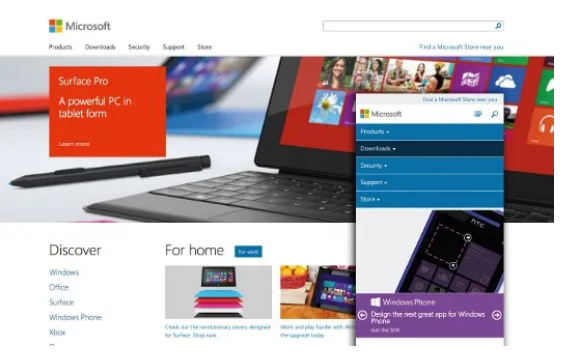
02. Microsoft
Microsoft’s website checks nearly every box on the responsive design checklist. It adapts seamlessly across screen sizes, maintaining functionality, readability, and brand consistency without sacrificing user experience.
03. Clearleft
British agency Clearleft’s responsive design keeps most of its content and imagery consistent across devices. Instead of overhauls, it streamlines elements into clean, easily tappable blocks—ensuring users get the same core experience whether they’re on a phone or desktop.

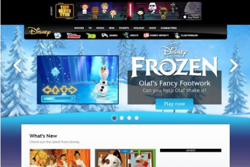
04. Disney
While Pixar’s site gets attention for its bold design concepts, Disney’s site stands out for its mobile approach: it delivers an almost entirely independent experience for small screens. It cuts back on features to reduce visual clutter on the initial mobile view, making it easier for users to focus on what matters.
05. Buffalo
Web design consultancy Buffalo simplifies its layout for small screens by reworking its featured images. It swaps the complex polygonal shapes of desktop images for simple squares—reducing visual noise while keeping the site’s unique aesthetic intact.