
Mobile design is a relatively new yet critical consideration. Just a decade ago, web design meant designing for desktop computers—today, it means designing for mobile devices too. Mobile phones drive a growing share of web traffic, and that trend shows no signs of slowing down.
According to Statista, October 2018 saw 3.9 billion unique mobile internet users worldwide, with over 50% of all website traffic coming from mobile devices. A strong web design is no longer a luxury—it’s a must-have.
Crafting a great mobile web experience takes more than just responsive design (though top website builders and smart web hosting choices can help). Below, you’ll find the foundational principles for designing effective mobile sites.

01. Build Goal-Focused Experiences
Mobile users are highly goal-driven. Every time they visit a site, they have a specific task in mind—and they expect to complete it quickly. Here’s how to make that happen:
- Start with your ideal users: Building a website is like building a house—you need a solid foundation. For great web design, that foundation is understanding your users. User research should be one of the first steps in product design. Figure out who your users are and what they want to accomplish. Once you understand their wants and needs, you can craft a user journey that aligns perfectly with their expectations (be sure to store any findings securely in cloud storage). Then, run thorough user testing to confirm you’ve hit those marks.
- Refine around your core objective: What do you want your website to achieve? Answering this question is key to shaping the mobile experience. Are you aiming to boost engagement, drive sales, or get users to sign up for a service? Clearly define your goal, then simplify the steps users need to take to reach it.
02. Adapt Content for Smaller Screens
Content is what gives most websites value—it’s the main reason people visit. When it comes to mobile design, you can’t just copy a desktop experience onto a phone; you need to design with mobile users in mind. That means tailoring content and features to fit their screen size and habits. Here’s how:
- Avoid horizontal scrolling: Users are comfortable with vertical scrolling, but horizontal scrolling frustrates them. Never force users to swipe left or right to see content. Fixed-width elements often cause this issue, so double-check that your content works across all viewport widths.
- Stick to a single-column layout: Single-column designs make the most of limited screen space and scale easily between portrait and landscape modes.
- Eliminate pinch-to-zoom: Users get frustrated fast if they have to zoom in or out to read text or view images. Design your mobile site so everything is readable and visible at default size.
- Use legible font sizes: 11 points is the absolute minimum for text—this size lets users read comfortably at a typical viewing distance without zooming.
- Choose scalable fonts: For readability, opt for sans-serif typefaces like Helvetica or Roboto, which work well on mobile screens.
- Design for fingers (not mice): Mobile users interact with screens using their fingers, which are larger than a mouse cursor. Create a finger-friendly interface with appropriately sized interactive elements. An MIT Touch Lab study revealed the average fingertip size is 8–10mm, so a 10mm x 10mm minimum touch target works best. Also, add space between interactive elements—if they’re too close, users may accidentally tap the wrong one.
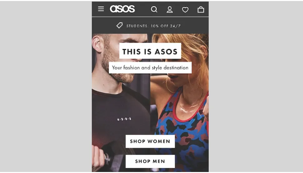
- Make product images expandable: Most people learn visually, so images are a great way to convey key messages quickly. For ecommerce sites, product images are even more critical—shoppers rely on them to make buying decisions. Provide high-quality images and let users expand the entire image (not just a portion) to see details.
- Be mindful of promotions and ads: Ads and promotions can easily overshadow your content. While some users might engage with them, most will ignore them—a phenomenon called “banner blindness.” Keep ads unobtrusive so they don’t disrupt the user experience.
- Keep contact info easy to find: Mobile users often visit sites to find contact details. Depending on their urgency, they might want to call, fill out a form, or find an address. For ecommerce sites, display the phone number directly on the homepage.

03. Optimize Content for Scanning
It’s a well-known fact: users don’t read online—they scan. When someone lands on your page, their first move is to scan and break content into easy-to-digest chunks. You can make this easier with these simple steps:
- Prioritize content order: People read top to bottom, so put the most important information at the top of the page. Organize the rest by hierarchy (most relevant to least).
- Cut the clutter: Focus on content over UI elements. Remove unnecessary functional or decorative features to reduce distractions. A minimalist style helps users stay focused on their task.
- Break up long text blocks: Large walls of text are almost always skipped. Use headings, short paragraphs, or bullet points to split up content.
- Highlight key elements: Make important items (like core messages) focal points so users see them immediately. Use size, whitespace, or bold colors to draw attention.
04. Create Predictable Navigation
Helping users navigate should be a top priority—even the best content is useless if people can’t find it. Invest in a strong navigation system with these tips:

- Use familiar patterns: Don’t reinvent the wheel. Stick to navigation styles most users know (like top bars or hamburger menus) instead of creating unique systems (e.g., gesture-based navigation). Familiarity lets users rely on their past experience to interact with your site.
- Limit navigation options: Desktop sites can handle long menus, but mobile sites can’t. Too many options force users to scroll endlessly. Aim for no more than seven distinct categories in your menu.
- Prioritize menu items: Organize navigation based on how users actually use your site. Put the most popular options at the top of the menu, and keep primary actions visible (not hidden).
- Write clear labels: Every navigation option needs a simple, easy-to-understand label. Avoid jargon—users shouldn’t have to guess what a link does. Clear labels help them predict the outcome of their taps.
- Make interactive elements look interactive: Design buttons and links to signal they’re clickable. For example, underlined text should be a link, and rectangular boxes with text should be buttons. Elements that look interactive but aren’t will confuse users.
- Show users where they are: “Where am I?” is a common question for navigators. Clearly indicate the current page (e.g., a highlighted menu item) so users don’t get lost.
- Add a search bar: For complex sites with lots of content, a search bar is a must. It gives users a fast way to find what they need—especially if they have a specific question. Don’t hide search in the menu; make it one of the first things users see.
- Let users return to the homepage easily: Visitors expect tapping the logo at the top of the page to take them home. Frustration sets in fast if this doesn’t work.
- Keep users in one window: Avoid CTAs that open new windows. Mobile users often struggle to switch between browser windows and may lose track of the original page.
05. Avoid Roadblocks
Roadblocks create friction, and friction kills conversions. Luckily, you can avoid most issues with these steps:
- Don’t interrupt users: Large pop-ups are one of the biggest annoyances in mobile design. For years, they were used for promotions—but now, many sites use intrusive pop-ups to request cookie consent (per GDPR rules). No matter what you’re sharing, make sure it doesn’t disrupt the user’s experience.
- Keep users on your site: Identify points in the user journey where people might leave (e.g., to find a coupon) and add content to keep them. For example, ecommerce sites often have promo code fields that send users searching for discounts. Instead, offer coupons directly on the site to prevent them from leaving.
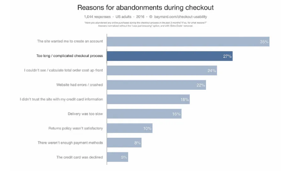
- Don’t force sign-ups: Making users register before accessing content or services has a high “interaction cost”—it often drives them away (a problem known as “login walls,” as noted by the Nielsen Norman Group). Visitors want to see what you offer before sharing personal info. Let them explore content without signing up, and for ecommerce sites, let shoppers check out as guests.
- Enable cross-device continuity: Mobile isn’t a standalone experience. Most users have multiple devices (desktop, phone, tablet) and expect a seamless transition between them. For example, someone might search for a product on mobile, then switch to desktop to buy it. Help them pick up where they left off with these steps: Sync wishlists, favorites, and shopping carts for logged-in users.
- Let non-registered users save or share info across devices (e.g., send a link to their email).
06. Design Efficient Forms
Filling out forms is one of the most common mobile tasks—but it’s also a major pain point. Keep friction low with these tips:
- Minimize inputs: The less data users have to enter, the better. Here’s how to cut keystrokes: Reduce the number of fields: Only ask for what you really need.
- Use auto-correct, auto-capitalization, and auto-complete to reduce errors.
- Skip drop-downs: They hide options and require extra taps. Use radio buttons instead for small selections.
- Auto-advance to the next field when users press “return.”
- Add real-time inline validation to catch errors early.
- Pre-fill fields for registered users (e.g., shipping addresses).
- Use device features: Let users scan credit cards with their camera instead of typing numbers, or integrate Apple Pay/Google Pay for one-tap checkout.
- Show the right keyboard: Mobile users appreciate sites that pull up the correct keyboard for each field. For example, a phone number field should show a numeric keypad. Use HTML input types to trigger the right keyboard: input type=”text”: Standard keyboard
- input type=”email”: Standard keyboard + “@” and “.com”
- input type=”tel”: Numeric (0–9) keypad
- input type=”number”: Keyboard with numbers and symbols
- input type=”date”: Device date picker
- input type=”datetime”: Device date and time picker
- input type=”month”: Device month/year picker
- Let users edit location: Many sites auto-detect a user’s location to show relevant content—but always let users change it. Sometimes, they’ll want results for a different area.
07. Aim for Consistent Experiences
Consistency is a cornerstone of great UX. Consistent design is intuitive design—so make sure your site is consistent both internally and externally.
- Internal consistency: Create a library of design assets (fonts, buttons, links, icons) and use them across every page. This keeps the visual experience cohesive.
- External consistency: Make your mobile site feel like part of your larger brand ecosystem. For example, if you have a mobile app, your mobile site should look and feel familiar to app users.
08. Build Your Best Mobile Site
All the tips above are industry best practices—but “best practices” don’t always equal the perfect solution for your site. That’s why testing is critical. Make usability testing a non-negotiable part of your design workflow, and refine the experience regularly.