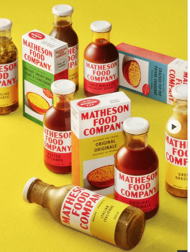
Matty Matheson—renowned chef and founder of Matheson Food Company—has cooked up an instant classic, bringing a cozy wave of retro nostalgia to Canadian pantries with his brand’s new product line. Drawing inspiration from 1930s design sensibilities, these stylish offerings deliver a bold yet timelessly elegant vibe that stands out in today’s packaging landscape.
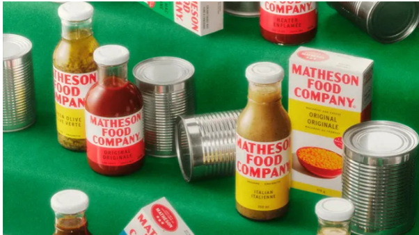
The nostalgia of 1930s advertising has often gotten lost amid the overly flashy, neon-heavy design fads of late. While modern packaging has dabbled in retro revivals here and there, Matheson Food Company fully embraces that vintage aesthetic—leaning into simplicity, sophistication, and effortless charm that feels both familiar and fresh.
To bring this vision to life, Matheson partnered with design studio Wedge. Their creative direction centered on the mantra: “Bold. Punchy. Memorable. Flavor.” As Wedge explains, the initial spark for the packaging came from Hereford Corned Beef—a childhood staple Matty grew up enjoying, whose timeless design left a lasting impression.
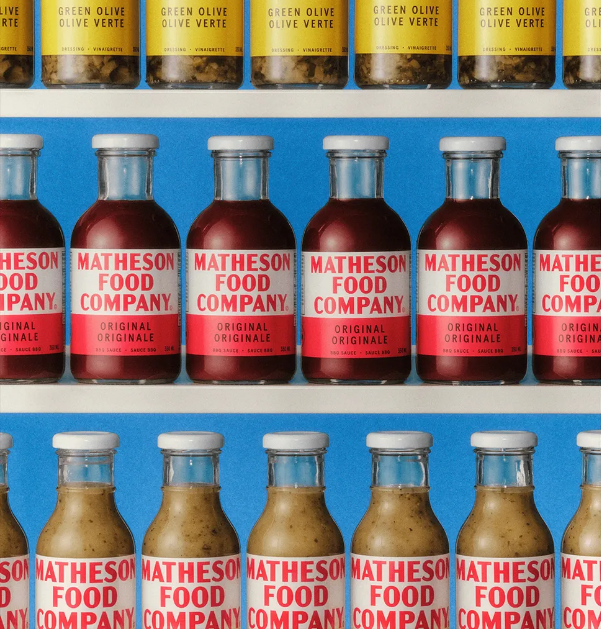
This vintage flair isn’t just for show; it’s an extension of Matty’s personal brand. Every package boasts vibrant primary hues, classic typography, and a subtle yet charming dose of personality—blending iconic retro design motifs with a clean, stripped-back style that feels modern.
The new product lineup includes BBQ sauces, salad dressings, and mac ‘n’ cheese—everyday favorites rooted in Matty’s own childhood memories. This mix of nostalgia and warm, personal touches gives the brand a wholesome, approachable feel that pairs perfectly with its retro packaging.
Want more packaging inspiration? Browse our roundup of standout designs that push the envelope. And don’t miss Illustrator’s new packaging tool—it’s poised to be a game-changer for designers everywhere.