Crafting eye-catching iOS app icons is a true art form. The best ones distill an app’s core purpose into a single compact square—one that needs to pop amid a cluttered home screen or App Store grid. These icons aren’t just pretty; they’re strategic, memorable, and perfectly aligned with their apps’ identities. Below, we’re highlighting 24 of the most exceptional iOS app icons and breaking down why they resonate so effectively.
If you’re aiming to land your app on lists like the best iPad Pro apps, this level of design detail is non-negotiable. For more expert guidance, check out our guide to nailing app icon design.
Apple’s success hinges on its relentless focus on detail—something that’s spawned countless iconic creations (remind yourself with our ranking of the 100 greatest Apple products). Apple users expect excellence across hardware and interfaces alike; a lackluster design is enough to turn them away.
For iOS app icons, getting this right is make-or-break. On the App Store, a strong icon can be the difference between a download and being overlooked. On home screens, it needs to be inviting and easy to spot to drive engagement. Read on for a curated collection of beautiful, innovative, and stylish app icons that nail this balance.
01. Evernote
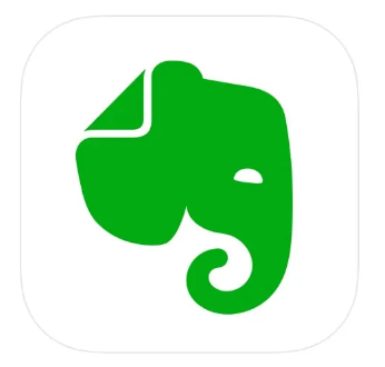
The note-taking app Evernote boasts a sleek, timeless icon. The elephant’s sleek outlines form a bold silhouette, and the minimalist block shape feels both modern and memorable. Plus, the icon’s symbolic nod—elephants never forget—earns extra credit for tying directly to the app’s purpose.
02. Headspace
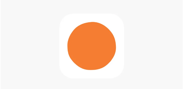
At first glance, Headspace’s icon (a bright orange circle on white) might seem simple—but it’s a masterclass in effective minimalism. The understated design mirrors the app’s mission: helping users de-stress through meditation. Just looking at that warm orange dot evokes a sense of calm.
03. Apple News
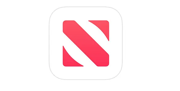
Including Apple’s own News icon might feel meta, but it’s well-deserved. The design is clever without being loud, using negative space brilliantly to form a crisp “n.” It’s subtle, intuitive, and perfectly on-brand—what’s not to admire?
04. Facetune
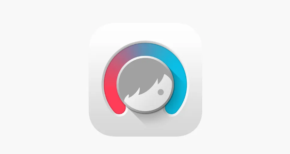
As one of the top photo-editing apps (especially for selfies), Facetune’s icon hits the mark. A stylized face takes center stage, clearly signaling its focus on portrait perfection. On-trend gradients showcase the brand’s colors, while a subtle 3D effect makes the central circle look like a tactile button you can’t help but tap.
05. Paper by WeTransfer
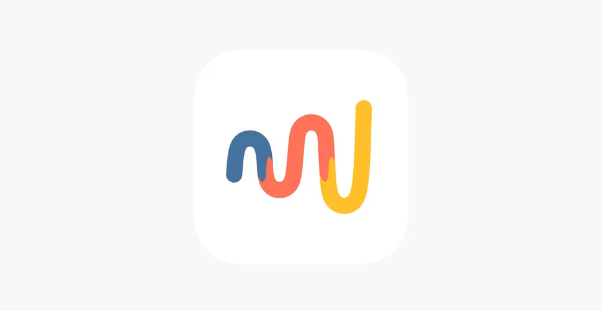
Best known for file-sharing, WeTransfer also offers the award-winning sketching app Paper—and its icon is a clever nod to both. The cool, outline-style design subtly echoes the parent brand’s “W,” while the drippy, vibrant colors hint at the app’s creative core.
06. Monument Valley
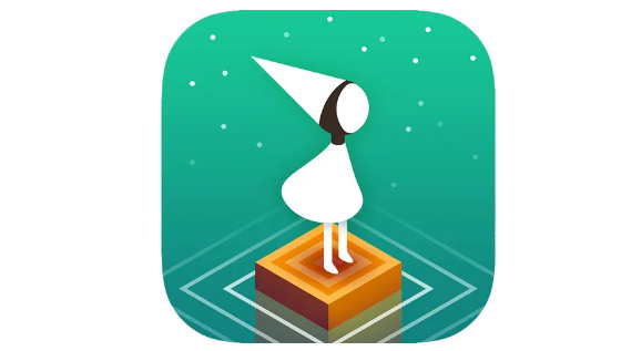
ustwo games’ Monument Valley is a modern classic (with a sequel and third installment in the works), and its icon sets the tone for the whimsical adventure ahead. It introduces the main character, Ida, while teasing the game’s minimalist isometric style—all wrapped in an air of mystery that pulls you in.
07. Tayasui Sketches

This drawing app prides itself on replicating traditional art tools, and its icon reflects that ethos. Stripped down to essentials, it features one of the app’s in-app drawing options—no loud colors or cluttered details (a common pitfall in art app icons). Instead, it offers a “blank canvas” vibe that perfectly matches the app’s “Zen-inspired UI.”
08. 1Password
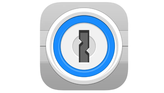
Sure, a padlock might seem obvious—but 1Password’s icon works because it’s instantly clear. It’s easy to spot on an iPhone or iPad, exudes authority on the App Store, and communicates the app’s core value: security. Users immediately feel confident that their data is safe.
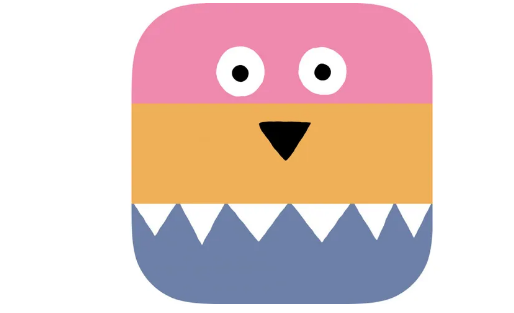
09. A Good Snowman Is Hard To Build
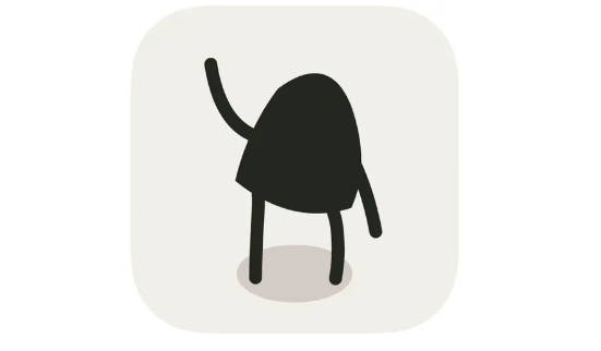
Most game characters are too complex for icons—but this app’s adorable monster is an exception. It stands out on home screens, even waving at you, and is utterly irresistible (unless you’re the monster itself).
10. Assembly
Assembly is like digital felt shapes—designed to appeal to both kids and designers—so its icon needs to be fun, creative, sharp, and colorful. The previous version featured the brand’s abstract bird logo, but it was too detailed to read at small sizes. This updated, streamlined take uses the same distinct color palette but works better at a glance.
11. Blek
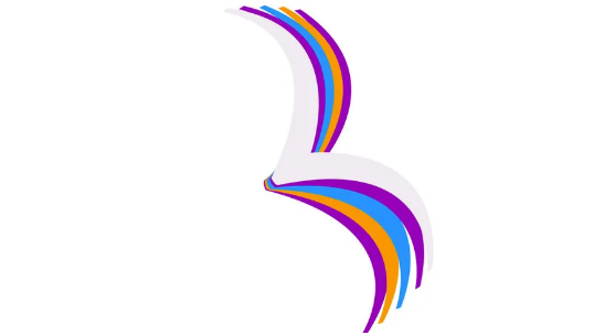
This game is all about guiding living calligraphy to hit targets—a concept too complex for a single icon. But Blek’s design nails the game’s elegance with a sweeping, memorable line that hints at its fluid, artistic gameplay.
12. Clear Todos
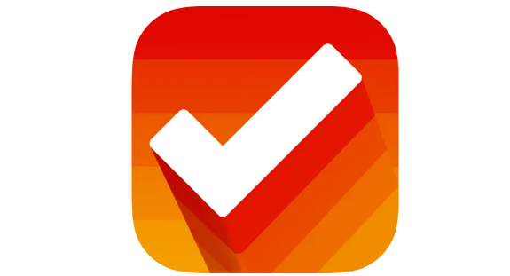
To-do apps are a dime a dozen, and most use a checkmark—but Clear Todos’ icon stands out. Its bright, upbeat colors and positive vibe suggest the clarity and productivity the app delivers, setting it apart from the ho-hum, overly serious competition.
13. DEVICE 6
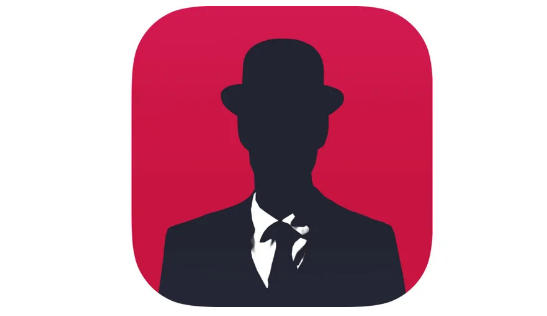
Simogo’s classic spy-themed game drops players into a world of conspiracy and mystery—and the icon captures that mood perfectly. Subdued yet menacing, with bold colors that evoke intrigue, it’s a fitting teaser for the game’s atmospheric adventure.
14. Doo – Get Things Done
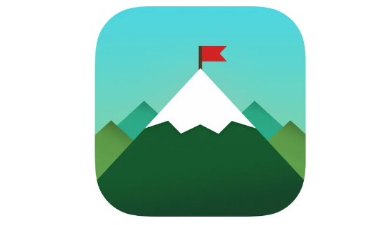
Checking off a to-do list feels like climbing a mountain—and that’s the inspiration behind Doo’s icon. It’s far more creative and fun than another generic checkmark, turning productivity into something playful.
15. Duolingo
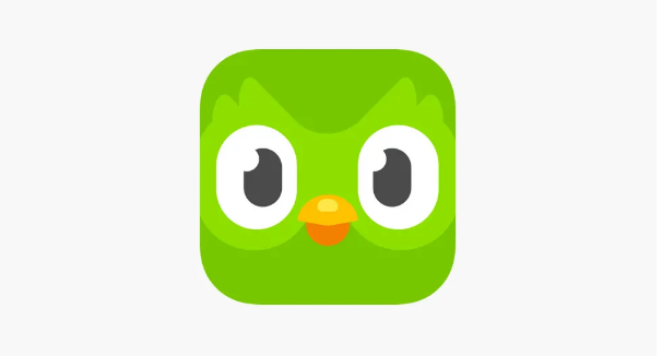
Learning a language can be intimidating, and most app icons in this space rely on boring flags or dry corporate designs. Duolingo breaks the mold with a friendly, cartoonish owl that feels approachable. Recent tweaks have made the character even more cheerful—and let’s be real, this hypnotic bird probably keeps you coming back for more.
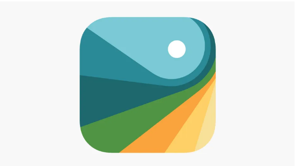
16. Earth Primer
This stunning interactive app dives deep into Earth’s science, and its icon is a microcosm of that focus. Subtle textures and drop shadows add depth, making the design feel as rich and layered as the planet itself.
17. Grayout
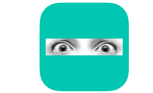
Photographs rarely work in modern iOS icons—but Grayout’s design is a standout exception. Terrified eyes “trapped” behind a solid color perfectly symbolize the game’s protagonist, who’s stuck in her own mind after an accident. It’s haunting and effective.
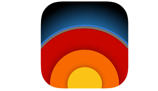
18. Launch Center Pro
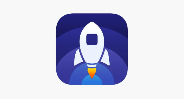
Designed to speed up app launches, this app’s icon features a zippy rocket—apt and instantly recognizable. Friendly, rounded curves and concentric circles add depth, while the updated color scheme (bolder hues with a pop of red) fixes the previous monochrome purple design’s lack of visual punch.
19. Miximal
Kids’ app icons are often garish, but Miximal’s has a welcoming, goofy charm. It also cleverly hints at the app’s premise: sliding screen parts to build quirky animals. It’s fun, colorful, and instantly appealing to its target audience.
20. Papers, Please
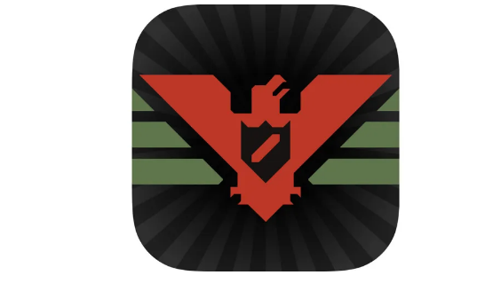
Game icons thrive when they capture the game’s tone—and Papers, Please’ does just that. Set in an oppressive regime, the icon uses stark, harsh imagery against a muted black-and-gray backdrop, perfectly reflecting the game’s tense, gritty atmosphere.
21. Procreate
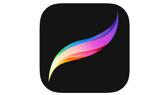
As one of the top digital art tools, Procreate’s icon is a study in elegance. A multicolored brushstroke takes center stage—restrained yet vibrant, much like the app itself. It’s sophisticated and instantly recognizable to artists.
22. Prune
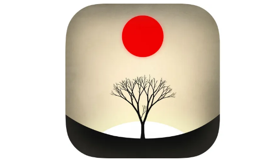
One of the more detailed icons on this list, Prune’s design features two key game elements: fragile trees you nurture and poisonous red orbs. It’s a striking image that looks great on home screens, balancing complexity with clarity.
23. Strata
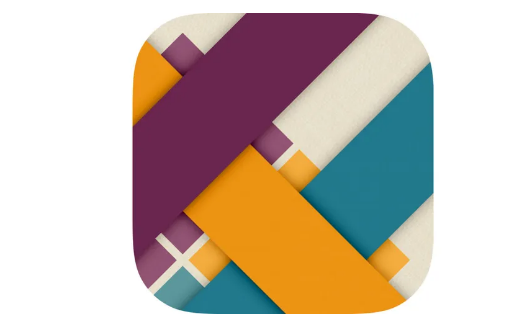
This puzzle game is about weaving ribbons, and its icon’s simple pattern fits seamlessly into iOS’s design language. Yet subtle shadows and faint textures recall the real-world materials the game simulates, adding a tactile feel.
24. Threes!
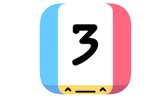
Threes! shines for infusing a sliding-tile puzzle with personality—and that energy carries over to its icon. Bright, breezy, and featuring a bold number “3” paired with a cheeky face, it’s as charming as the game itself.