There’s a popular idea floating around the internet that sooner or later, every man in his twenties or thirties ends up buying some gadget or toy he either owned or desperately wanted as a kid. I chuckled when I first heard that—until it hit me that I’d become a perfect example. This year, I fell back in love with the iPod, and it’s taken over a small part of my life.
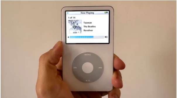
It started with the iPod Mini—the one I’d always wanted but never had. I bought one, then modded it with a fresh battery and more storage (which, by the way, is a surprisingly fun and simple process). Then, pulled even deeper by nostalgia, I tracked down the same fifth-generation iPod I owned as a teenager and gave it the same treatment. And as I lean further into my “things-used-to-be-better” phase, I’ve become convinced of one thing: Apple’s design during the decade from 1998 to 2007 was truly special.
That ten-year stretch was a turning point for Apple. It’s the era that gave us the iMac, the iPod, and the original iPhone—the “iYears,” you might call them. And looking back, what stands out most about those products is their personality.
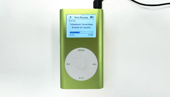
Holding those iPods again, I noticed something: I appreciate them not just as gadgets, but as objects. In a recent interview, Apple’s former design chief Jony Ive talked about how important it is for users to feel there are people behind a product. Even now, two decades later, I get that sense from the iPod. You can tell it was made by people who wanted you to enjoy using it. The compact shape, the smooth rounded edges, the simple interface, and that satisfying click wheel—it all adds up to an experience that feels both effortless and fun.
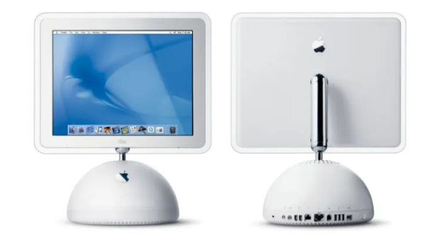
That playful spirit runs through almost everything Apple launched during that time. The colorful iBook laptops looked like toys in the best way. The iMac G4, with its floating screen, drew inspiration from a sunflower. Even commercial flops like the Power Mac G4 Cube stayed true to Apple’s “Think Different” ethos.

And believe it or not, there was a time when each new iPhone looked completely different from the last. It wasn’t until the iPhone 3GS that Apple reused a design—and even then, it followed up with the stunning and entirely new iPhone 4. These days, most updates are incremental. Getting a whole new design each year feels like a distant memory.
So why has design become so…safe? I don’t put all the blame on Apple. The real shift happened as our devices became all-purpose machines. Gadgets like the iPod had a clear, focused role. That gave designers room to give them character, to fit a certain lifestyle. But today, a smartphone or tablet has to do everything—so it mostly becomes a screen. Year to year, the only noticeable change is the size of those black glass rectangles on the front or back.
I still remember how Apple products in the 2000s made a statement. In a sea of black and gray Microsoft gear, they stood for color, fun, and creativity. Those white iPod earbuds were instantly iconic. But nowadays, it feels like brands can’t afford to stand out. When a device does everything, its design almost has to do…nothing.
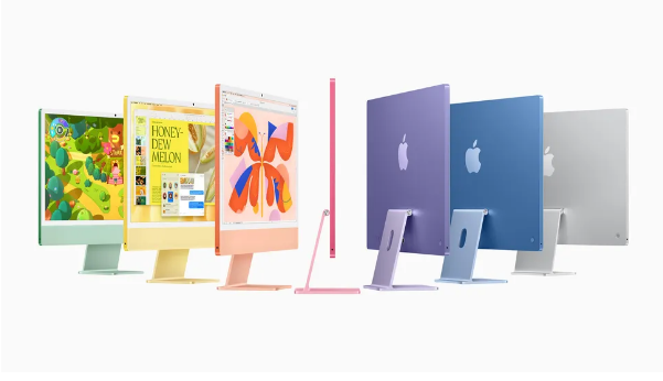
If there’s one current Apple product that reminds me of that joyful past, it’s the latest iMac. With its soft pastel shades and gentle curves, it feels pretty just for the sake of being pretty. And ironically, it’s also the product reviewers often call “irrelevant.” Today, tech is meant to fade away—into our pockets or behind ever-expanding screens. As The Verge put it, this iMac “was not built for this world.”
But maybe things are turning around. With Gen Z rediscovering early-2000s tech, the revival of simple “dumb phones,” and more people questioning their screen time, perhaps fun and bold design will make a comeback. Until then, you’ll find me in the garage, looking through rose-tinted glasses—and probably modding another iPod.