Bold minimalism—now with a vitamin-packed twist.
When it comes to branding nutritional beverages, companies often face a challenge: emphasize the science and ingredients, and you risk making the product look more like medicine than something refreshing. Coca-Cola’s vitaminwater has taken a completely different path with its recent redesign.
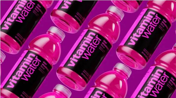
Moving away from its earlier clinical appearance, the brand now embraces a vibrant, playful identity that’s more about personality than lab results. Inspired by the bold minimalism trend, the new design injects character and even pays subtle homage to its predecessor—with a few hidden details tucked into the logo.
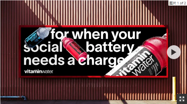
The goal? Stand out in a crowded beverage aisle. With stronger shelf impact and clearer flavor cues, the rebrand aims to make vitaminwater instantly recognizable.
Eye-catching, full-bleed color labels help shoppers quickly identify their favorite flavors—including two new additions: “Elevate” (blue raspberry limeade) and “Re-hydrate” (pineapple passion fruit). To make things even clearer, the zero-sugar options now come with crisp white labels, setting them apart from the original versions.
Speaking of the logo—it’s bigger, bolder, and now set in the modern TWK Lausanne typeface, replacing the classic Helvetica. Look closer, and you’ll discover thoughtful touches: the letter “a” is shaped like a water droplet, replacing the separate drop graphic used before. Even the dot on the “i” stretches out, mimicking the shape of a vitamin tablet.
According to the design agency forpeople, these refinements help reduce visual noise and create a strong, unified “front-face” for the brand—boosting recognition at a glance.
The brand’s voice got a refresh, too. Gone is the dry, health-heavy language. In its place: a witty, slightly irreverent tone reminiscent of brands like Innocent. The aim is to resonate with younger consumers and reconnect with vitaminwater’s New York roots. Instead of promising better immunity or focus, the new captions read: “Immunity from all the BS,” or invite you to “Focus: Time for a full review of your ex’s profile.”
One flavor boasts “A threesome of antioxidants & full uncensored flavor,” while another claims: “Sports drink levels of electrolytes. For when you went so hard you had to go home.”
This playful approach stands in contrast to Coca-Cola’s recent rebrand of Bodyarmor, which highlights ingredients and scientific benefits to compete with giants like Gatorade and Powerade.
Rapha Abreu, Global Vice President of Design at The Coca-Cola Company, explains: “When vitaminwater launched, it was ahead of its time in the enhanced water category. Now that everyone’s caught up, our job is to keep the brand culturally relevant. What started as fresh and iconic had lost some of its energy over the years. We needed a visual and verbal punch to cut through the noise on shelves today.”