I never imagined I’d end up writing something critical of Taylor Swift. I’ve been a die-hard fan ever since her Eras Tour movie hooked me, and even though my usual music taste leans toward post-rock, punk, and metal, her pandemic-era albums Evermore and Folklore hit a emotional chord I didn’t know pop music could reach.
For a long time, I genuinely thought Taylor could do no wrong. But sadly, her latest website is a textbook example of how not to design with inclusion in mind. It’s so problematic that a week ago, brand and web designer Lauren Sherrard felt obligated to call it out on LinkedIn—and honestly? She was 100% right.
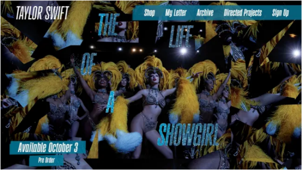
Take the original design: orangey-red text against a glittering green background. It wasn’t just a questionable aesthetic choice; it was a nightmare for anyone with color blindness. From what I can tell, that specific issue has since been fixed, but many of the other problems Lauren highlighted are still there. There’s the drop shadow on text that muddles readability, the tiny font sizes (a stark contrast to fonts built for accessibility), and the narrow typeface that blurs together—like someone took every accessibility rule and did the exact opposite.
When Design Hurts: Who’s Being Left Out?
All-caps text might look bold and dramatic, but it’s incredibly hard for people with dyslexia to process. Worse, screen readers often spell out all-caps text letter by letter—picture hearing “T-A-Y-L-O-R-S-W-I-F-T” instead of just “Taylor Swift.” And those glittery effects? They don’t just make text harder to read; for people with certain visual conditions, they can cause uncomfortable afterimages or even make the page physically painful to look at.
Imagine being a dedicated Swiftie with dyslexia, squinting to make sense of those uniform, narrow letters that blur into one another. Think about screen reader users hitting missing alt text (the descriptions that make images understandable) or incorrect labels that turn the site into a puzzle. As Holly Tuke, a social media manager at the Royal National Institute of Blind People (RNIB), put it in response to Lauren’s post: “It’s so hard to be a disabled fan sometimes. When everyone else is excited, we’re left feeling excluded—facing that same lack of accessibility all over again. And it hurts.”
This Shouldn’t Happen—Not to a Star Like Taylor
Let’s be real: The pop industry has no excuse for dropping the ball here. Beyoncé faced lawsuits over similar accessibility failures on her website. Universal Music Group, Taylor’s label, has been called out for this before. Even the Eras Tour itself drew criticism for ticketing systems that locked disabled fans out of buying tickets.
Yet here we are again, watching the same basic mistakes play out on one of the most high-profile websites in the world.
I want to believe Taylor herself has no idea these issues exist. After all, this is an artist who’s always shown real care for her fans: she advocates fiercely for artists’ rights, donates generously to food banks, and stands in support of the LGBTQ+ community. I truly don’t think she’d ever intentionally shut disabled fans out of her work.
But someone on her team definitely should have caught this. A global superstar with Taylor’s budget and resources has zero excuse to launch a website that fails basic accessibility standards. And let’s not forget: a website that follows accessibility guidelines isn’t just better for disabled people—it’s a better website, full stop.
Taylor’s last album was all about Tortured Poets, but her websites shouldn’t torture her fans. The best thing about music is how it brings people together—no exceptions. So here’s my ask to the music industry: Let’s make sure our web design does the same.