Prioritize Inclusivity Over Just Looks

By now, most Swifties have (sort of) calmed down from the collective excitement surrounding Taylor Swift’s upcoming album announcement. While many fans gushed over the album cover’s design, the rollout came with a major, even damaging flaw—its color scheme. Orange and green might look eye-catching together, but for millions of users, this palette is a accessibility nightmare. And that’s why Swift’s website misstep holds a vital lesson for anyone building or designing content online.
You can hire top-tier designers or use the most advanced website-building tools, but if accessibility isn’t a core part of your design process, you’ll end up shutting out a huge portion of your audience. In 2024, great design means balancing aesthetics and inclusivity—and unfortunately, Taylor’s website falls short on that front.
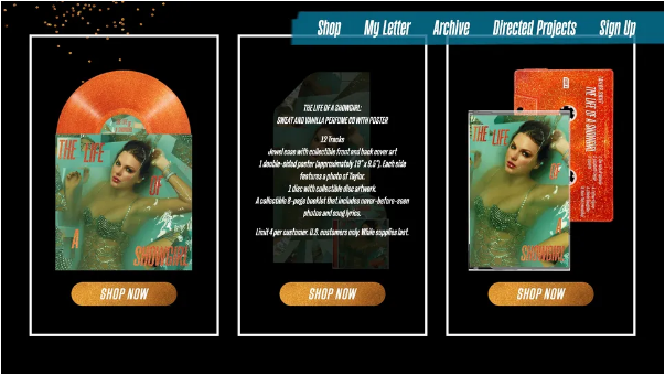
The issues with the website’s revamp were first called out by Lauren Sherrard, a brand and web designer who specializes in accessible digital spaces. In a detailed post on her own site, Sherrard broke down the website’s multiple accessibility failings, emphasizing that functionality should never be an afterthought—especially for a project backed by a billionaire artist and a major record label.

At the heart of the problem, Sherrard explains, is the orange-and-green color pair: their positions on the color wheel are so close that they’re “nearly impossible to tell apart” for people with color blindness. But the issues don’t stop there. She also flagged the site’s glittery, moving graphics (which can overwhelm users with visual processing differences), extremely small text that’s hard to read, and all-caps sections—elements that create unnecessary barriers for many visitors.
“Taylor Swift’s new website is a perfect example of how accessibility gets pushed to the side in digital design,” Sherrard told Creative Bloq. “Low contrast between colors, tiny fonts, missing image descriptions [alt text], and broken HTML—all of these things block people from using the site and take away their ability to engage independently.”

She stressed that accessibility isn’t something you can “fix later” with a quick helpdesk ticket. “It has to be built in from day one,” Sherrard added. “Start with accessibility in your branding choices, then carry that focus through every step of designing and building the website.”
