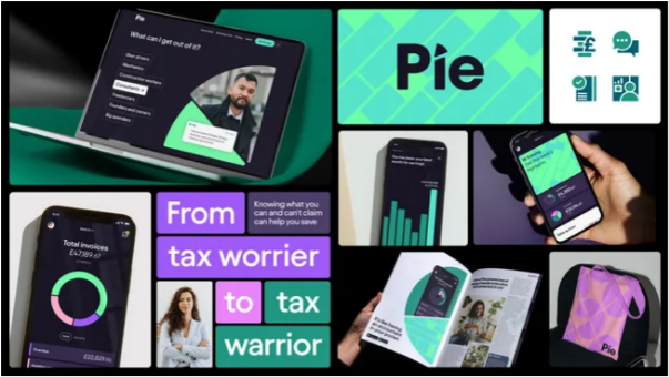
Let’s be real—taxes are tedious, confusing, and no one’s idea of a good time. But that’s starting to change, thanks to Pie: a fresh tax app that puts financial know-how (usually only available to folks with a personal financial advisor) in everyone’s pocket. Simple to navigate, tailored to your needs, and designed to reward smart financial choices, Pie helps users take charge of their taxes—all with a clear promise: “It’s your money—claim it.”
What makes this game-changing app so user-friendly and visually striking? Credit goes to the team at Studio Output, who shaped Pie’s brand strategy, visual identity, and product design from the ground up.
“Tech startups often prioritize building their product or securing funding first, but Pie wanted to launch with a fully realized brand and seamless user experience day one,” explains Mark Robbins of Studio Output. “That gave us a unique chance to craft a cohesive, engaging story that runs through every part of the brand—from the app to the messaging,” adds his colleague Sam Hodges.
To pull back the curtain on how Pie came to life, we sat down with Robbins and Hodges to discuss their process, inspiration, and challenges.
How Does Pie’s Visual Language Match Its Service?
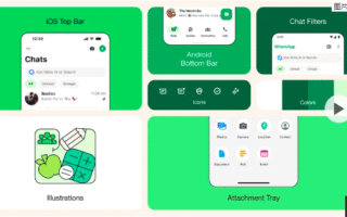
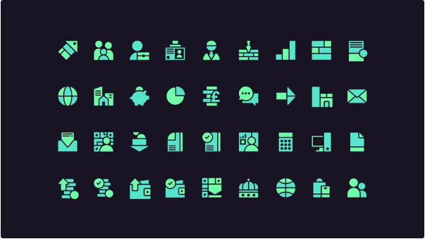
At the heart of Pie’s identity is a simple, powerful idea: the divisibility of a pie chart. Not only does it tie directly to the app’s name—it’s also a key tool for understanding earnings, expenses, and taxes.
This “pie chart” design system became the backbone of everything: it guides brand assets, icons, layouts, app components, and even the digital interface itself. It’s functional, but it also has personality—every element clearly links back to what Pie stands for.
When designing the app, we knew clarity was non-negotiable: tax info needs to be easy to digest and use. So Pie’s visual language does double duty: it creates memorable, approachable moments for users and powers the core, hardworking features that make the app useful day-to-day.
What Inspired the Team?
Like a lot of people, we’ve all felt the pain of doing freelance taxes—every year, it’s a hassle: confusing forms, jargon, and that sinking feeling you’re missing out on deductions. We wanted to fix that: make taxes easier, more engaging, and open up financial expertise to everyone (not just a lucky few).
Plus, with the UK government’s new “Making Tax Digital” scheme rolling out, we knew many people would struggle with the shift to digital tax filing. Our goal? Build a tax app people are proud to use—one that saves them money and makes them feel in control of their finances.
How Did the Studio Output Team Collaborate?
Studio Output has two core design teams: brand design and digital design. These teams work side-by-side—testing each other’s ideas, pushing one another to go further, and challenging assumptions. That collaboration was key: it made sure what we created wasn’t just unique and eye-catching, but also practical and engaging for users.
What Challenges Did They Face?
Everything circled back to the product. We were tasked with building Pie’s brand and marketing, but first and foremost, we had to support the app itself: it needed to be usable, engaging, and stand out from every other tax app on the market.
The brand concept also had to be flexible: simple enough to work in the app’s smallest details, but scalable enough to shine in big marketing campaigns. It needed range—something that could power functional product design and feel vibrant in ads or social media.
What’s Their Favorite Part of the Finished Product?
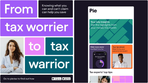
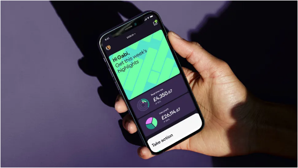
It was incredibly rewarding to build something that’s both compelling and hardworking. Brand systems often don’t get tested as rigorously as they should, but this process was exacting—every element had to pull its weight. We also loved personalizing the tax experience: on the website and in the app, we show users exactly which features matter most to them (whether they’re freelancers, side-hustlers, or small business owners).

Which Part of the Process Did They Enjoy Most?
The back-and-forth between the brand and digital teams. The Pie design language started with a simple concept from the brand team—but once we collaborated with the digital team, it grew into a full, comprehensive system.
We pushed each other constantly: iterating, tweaking, and making the system stronger. Brand designers had to think like user experience experts: “How will this idea make the app easier to use?” And digital designers were challenged to create something more than just functional—something memorable and distinct.
How Accessible Is Pie’s Identity?
Building accessibility into the app wasn’t an afterthought—it raises the bar for usability across the tax sector, and everyone benefits from that. All our digital work meets at least WCAG AA compliance (the industry standard for accessibility), and that’s a non-negotiable for every brand we build. When working with our development partners, we go even further: we make sure the experience itself supports all users, no matter their needs.
How Does This Branding Help Pie Stand Out?
To make Pie engaging and unique, we looked beyond the tax world—we drew inspiration from apps people use daily, like music streamers or fitness trackers. These apps keep users coming back because they’re intuitive and even enjoyable. We wanted Pie to feel the same way: not like a cold, boring accounting tool, but something you actually look forward to using.