Standout Examples + Go-To Online Resources
Crafting standout packaging design isn’t a walk in the park—it takes real creativity and innovation to think outside the box, quite literally. Not only does the packaging need to reflect the product itself, but it also has to catch the eye and appeal to shoppers in a crowded market where trends shift constantly.
And in today’s increasingly eco-conscious world, designers are tasked with balancing showstopping visuals with sustainable materials and practices that put the planet first. Below, we’ve rounded up 20 of our favorite packaging design examples to spark ideas for your next project—plus top online resources to keep the inspiration flowing.
Best Packaging Design Inspiration
01. Benefit’s 2024 Benemart Holiday Pop-Up Collection
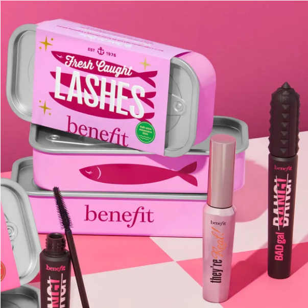
There’s something irresistibly charming about mimetic design—where products are crafted to look like something totally unrelated. Benefit Cosmetics nailed this for its 2024 Benemart Holiday Pop-Up Shop, putting a fun, retro spin on pantry staples. Bright and full of personality, the packaging breaks from the minimalist, stripped-back look that’s popular among many modern beauty brands: think products shaped like soup tins, chocolate bars, and even canned fish. It’s playful, nostalgic, and impossible to miss on shelves.
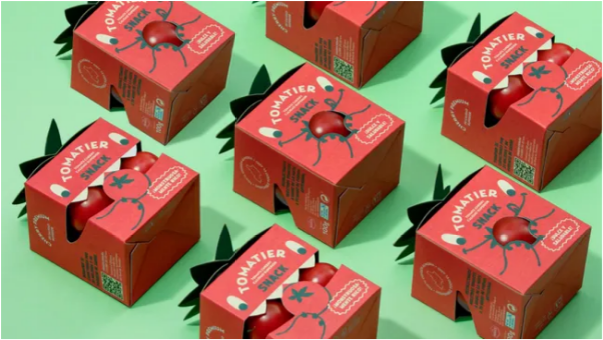
02. Tomatier Snacks (Nijasol x Meteorito)
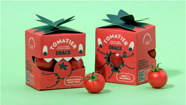
A little whimsy goes a long way—and that’s exactly what Valencia-based studio Meteorito brought to Tomatier Snacks. Designed for tomato farmer Nijasol as a special-edition snack sold at Carrefour, the packaging targets kids (and their parents) with a friendly, tomato-shaped “monster” that “loves eating tomatoes.” The monster’s mouth doubles as a window, letting shoppers see the cherry tomatoes inside. It’s unique, playful, and turns a simple snack into something fun.
03. FreeWater
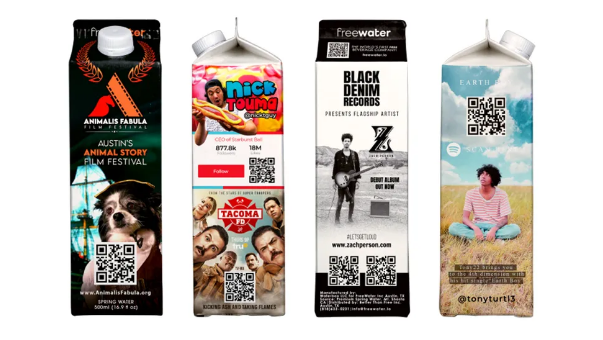
This packaging might not win awards for beauty—but it’s a game-changer for how we think about product and packaging design. That’s why it’s on our list.
Many brands treat their products like walking ads: Big-name clothing companies, for example, turn hoodies and tees into “mobile billboards” people pay to wear. But what if products could also promote other brands to offset at least some of their own costs?
U.S.-based startup FreeWater is testing that idea with a bold proposition: Its spring water (in paper cartons and aluminum bottles) is free. The company even donates 10 cents from every product sold to charities like Well Aware—and it’s planning to launch free vending machines to stock its water. Is this a clever way to make products accessible, or a dystopian advertising experiment? You decide.
04. Who Gives a Crap’s “The Play Edition”
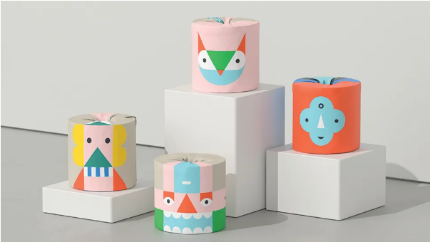
Australian brand Who Gives a Crap is known for eco-friendly tissues, paper towels, and toilet paper—plus donating half its profits to build toilets in underserved communities. For its special-edition “The Play Edition” toilet paper, design studio Garbett created packaging that encourages play, not just practicality.
“The idea came from kids’ mix-and-match books—you can stack the packs in different ways to make silly totemic characters,” says Garbett creative director Paul Garbett. And for extra fun? The outer carton is recyclable and can be turned into a tiny stage for kids to use.
05. Hardy Smoked Salmon
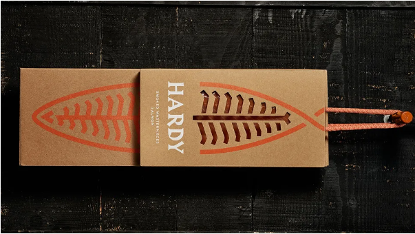
Hardy, a third-generation family-owned business specializing in smoked salmon, wanted packaging that screamed “premium quality.” So the brand partnered with Portugal-based studio This is Pacifica to redesign its stationery, packaging, and website—with a focus on the care that goes into every batch.
“It’s a slow process you can’t rush,” explains This is Pacifica creative director Pedro Mesquita. “From salting to smoking, every step is done perfectly. That’s why we came up with ‘Hardy Smoked Masterpieces’ as the core idea.”
The design pairs two key elements: an abstract salmon symbol and a sharp, knife-like wordmark. “The packaging is an extension of the brand,” Mesquita adds. “It’s made entirely from raw micro-corrugated cardboard printed with UV ink—simple, but luxurious.”
06. Stefano Sauces (lg2 x Stefano Faita)
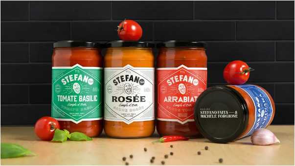
Montreal agency lg2 took a fresh approach to branding Stefano Sauces, the first ready-to-eat line from celebrity chef Stefano Faita and his partner Michele Forgione. The star of the design? A lively, energetic caricature of Faita himself. Each sauce jar also gets a unique typography treatment, with nutritional and legal info presented in an unexpected vertical layout outside the main label shape.
“Standing out in the sauce category is tough—most brands blend together on shelves,” says lg2 creative director David Kessous. “The originality of this concept gave us a really appealing identity and packaging that jumps out at shoppers.”
07. Fierce & Noble Craft Brewery
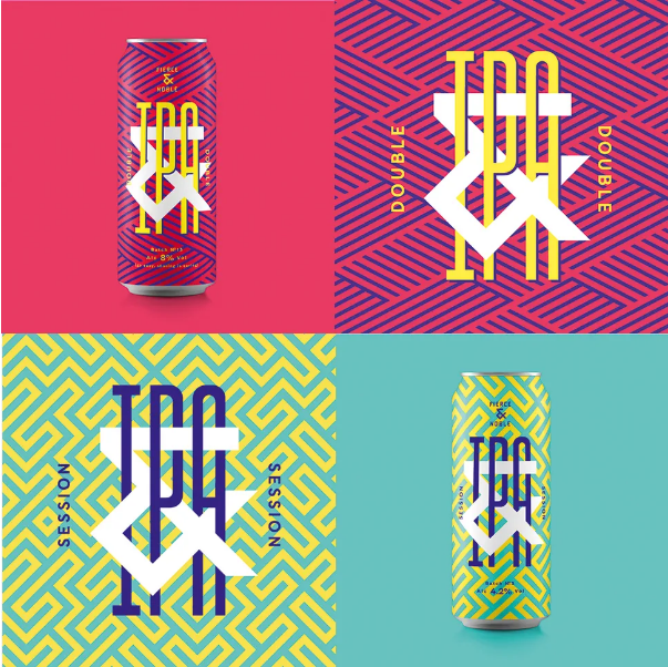
Bristol-based studio Halo was tasked with building a strategy, name, brand identity, and packaging for Fierce & Noble—a new craft brewery in St. Werburghs, Bristol. The name says it all: “Fierce” nods to the team’s independent spirit, while “Noble” honors the craft’s heritage. The bold design (complete with custom typography and one-of-a-kind patterns) reflects the vibrant, creative neighborhood the brewery calls home.
“The product needed to pop on bar tops and store shelves,” says Halo design director Andy German. “Since the brewery is in a busy, creative part of Bristol—with other craft breweries nearby—it made sense to make the packaging stand out. The main brand pattern is based on the ampersand we created—I’ll admit my eyes got a little fuzzy designing it!”
08. Beck’s Colors Album Sleeve
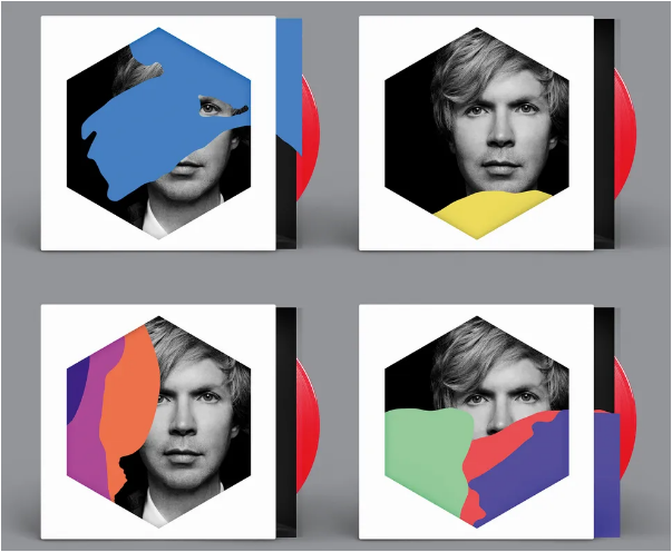
Musician Beck’s latest album, Colors, features a customizable record sleeve designed by Jimmy Turrell and Steve Stacey. Made from layers of die-cut colored transparencies, listeners can mix and match the layers to create their own one-of-a-kind cover.
“We landed on color and shape—simple, but impactful,” says Turrell, who also served as art director and video director for the project. “We didn’t set too many rules early on. We drew inspiration from all over: childhood games like Ludo and Connect 4, old VHS and cassette packaging, even artists like Bridget Riley and Piet Mondrian. Beck was totally on board with us experimenting. Seeing it out in the world—and getting such positive feedback—has been really satisfying.”
09. CS Light Bulbs
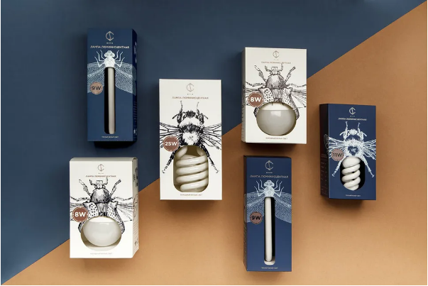
Everyday items like light bulbs usually get utilitarian packaging—but Belarus-based electrical company CS flipped the script with boxes that turn the bulb into a key part of the design.
Designed by Angelina Pischikova (with line illustrations by Anna Orlovskaya), the packaging uses detailed insect drawings, and each bulb is paired with a bug that matches its shape or size. Long, thin bulbs go in dragonfly-themed boxes, while coiled energy-saving bulbs become the abdomen of a bumblebee. It turns a boring household item into something charming.
10. Leafs by Snoop
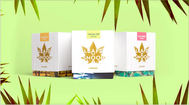
As cannabis becomes legalized across more U.S. states, cannabis branding and packaging are finally getting the spotlight—and Snoop Dogg’s Leafs by Snoop line (designed by Pentagram) is a standout.
Gone are the days of buying weed in a grubby little bag. Pentagram’s designs include a bold leaf logo (with an animated version), luxury weed boxes, and a range of edibles—including six chocolate bars and “Dogg Treats” cannabis candies. It’s sleek, playful, and fits Snoop’s iconic vibe.
11. “Colour Me Blind” Grocery Packaging
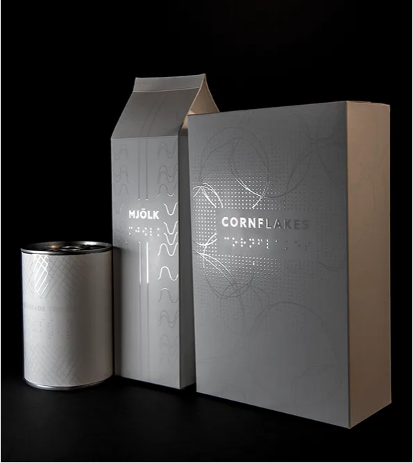
Graphic design student Alexandra Burling set out to answer a question for her graduation project: Can packaging be both aesthetically pleasing and accessible to people with visual impairments? She focused on groceries—an area where accessibility is often an afterthought.
“I wanted blind people to have the freedom to do something as simple as go to the supermarket and buy milk,” Burling explains. “The goal was to start a conversation and push for more innovative packaging that appeals to more senses than just sight.”
12. Nike Air Sneaker Packaging
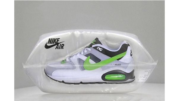
Nike Air is one of the most iconic sneaker designs ever—but Berlin agency Scholz & Friends didn’t stop at the shoe itself. They reimagined the packaging to highlight the “Air” in Nike Air.
The sneakers come in an airtight plastic pouch, creating the illusion of the shoes floating. Not only does this emphasize the shoe’s signature Air cushioning—it also reduces damage during shipping. It’s functional, eye-catching, and true to the brand.
13. Onuma Honey
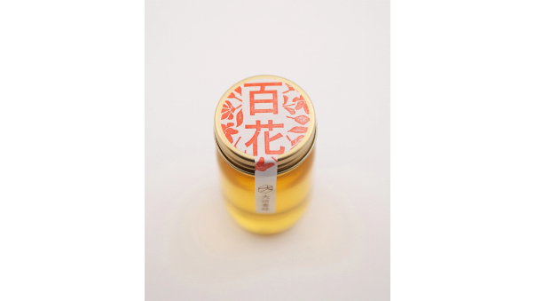
Japanese studio Akaoni Design proves that “less is more” with Onuma Honey’s packaging. It’s simple: a small jar, plain stickers, classic brown paper, and a few sweet colored stamps to finish it off. Art directed by Motoki Koitabashi, the design is understated—but it stands out in a sea of over-the-top honey jars. Sometimes, simplicity is the best way to make an impact.
14. Spine Vodka
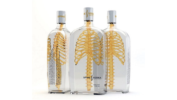
German designer Johannes Schulz created Spine Vodka’s packaging as a personal project after graduating from an international communication design school in Hamburg. “Spine is a high-quality product, and the design matches that—minimal, simple, but with a deliberate twist in its message,” Schulz explains. “The name ‘Spine’ fits perfectly with the concept.”
The packaging integrates a spine and ribcage design to give the product “backbone”—and its 3D approach sets it apart from flat, 2D vodka bottles. “The transparent glass shows the product has nothing to hide,” Schulz adds.
15. Allsorts Black and White
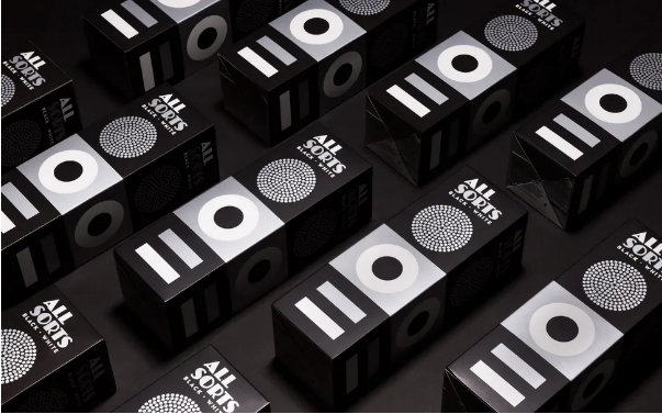
Back in 2014, Bond Creative Agency gave Liquorice Allsorts (owned by Nordic confectionery giant Cloetta) a mini makeover, using the sweets’ iconic shapes and colors for a modern update. Now, Bond has done it again for Cloetta’s Black and White edition—this time stripping away the color.
“The silver print and matte finish add a ‘tasty’ touch to the functional cardboard box,” Bond says. It’s a subtle update, but it keeps the classic Allsorts vibe while feeling fresh.
16. Stranger & Stranger Spirit No. 13
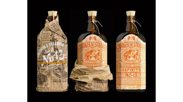
Beverage design experts Stranger & Stranger created a limited-edition holiday liquor—Spirit No. 13—with one of the most detailed labels you’ll ever see. The vintage-inspired label is packed with over 500 words, and the bottle comes wrapped in a custom-printed newspaper to give it a “moonshine” feel. It’s a fun, nostalgic nod to old-school liquor packaging—with a high-end twist.
17. TIQLD Spice Blends
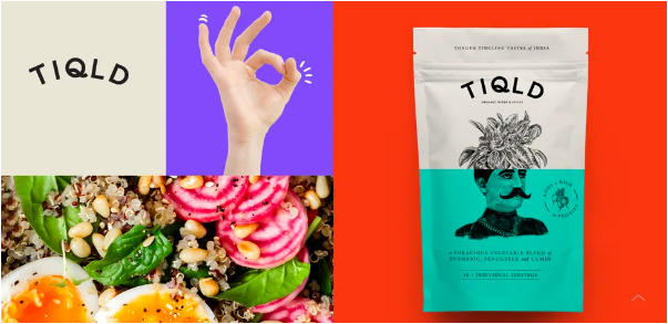
Design studio Alphabet used playful illustrations to give TIQLD spice blends a bold, confident identity. Each pouch has a split design that pairs unexpected objects: Think a base ingredient (like meat, fish, or veggies) with an abstract element that tells the story behind the spice blend.
“We wanted the brand imagery to feel bold and adventurous—just like the flavors,” Alphabet explains. “The stories on the packaging don’t just show the brand’s personality—they also highlight how bold the spices are.”
18. Poilu Paintbrushes
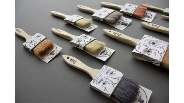
Designer Simon Laliberté’s Poilu Paintbrushes packaging is as functional as it is clever. It uses a single piece of double-sided printed cardboard to hold two paintbrushes—and some of the brushes’ natural hairs are dyed to look like mustaches and beards. The typography on the brush handles is a nice touch, too. It turns a simple art supply into something whimsical.
19. Mighty Nuts Pistachios
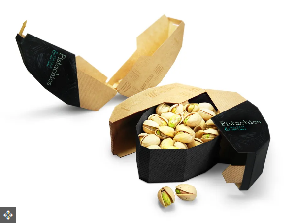
Pratt Institute packaging design student Maija Rozenfelde created Mighty Nuts’ pistachio packaging with two goals: great user experience and a second life for the package. “I wanted the graphics to show how crunchy pistachios are—that’s why I used hand-drawn typography,” Rozenfelde says. The design is fun, functional, and shows that student work can compete with professional projects.
20. Helvetimart Specialty Foods
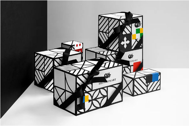
Swiss specialty food shop Helvetimart turned to branding heavyweight Anagrama for its packaging. Anagrama drew inspiration from the flags of Switzerland’s 26 cantons (sovereign states), simplifying the flags to create a cohesive look.
“We used key elements and colors from each canton’s flag to design the product labels and in-store signage,” Anagrama explains. “It not only gives the brand a local feel—it also makes it easier for shoppers to navigate the store.”
Top Packaging Design Resources
The internet is overflowing with packaging design inspiration—but too many options can be overwhelming. Here are our top picks to help you narrow it down:
01. Packaging of the World
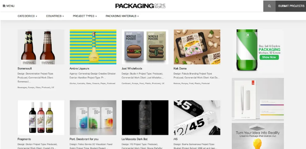
This vast gallery features some of the most intriguing and creative packaging designs from around the globe. What makes it stand out? It’s super organized: You can search by category, country, product type, or popularity to find exactly what you’re looking for. Plus, it’s updated regularly with fresh examples—perfect for staying in the loop.
02. The Dieline
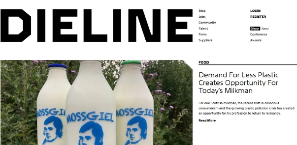
Founded in 2007, The Dieline is a go-to for anyone who loves packaging design. It’s not just a gallery: The site also shares news, opinion pieces, job listings, and a directory of packaging designers and suppliers. Its mission? To highlight and celebrate the best packaging design in the world.
03. BP&O
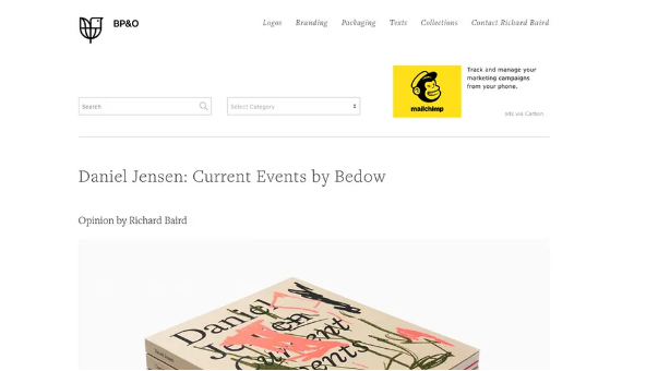
Run by British freelance designer Richard Baird (a former writer for The Dieline), BP&O is a blog focused on branding and packaging. Baird breaks down recent designs, shares background info, and offers his honest thoughts—making it a great resource for understanding the “why” behind great packaging. It’s perfect for discovering new work from designers worldwide.
04. Dezeen
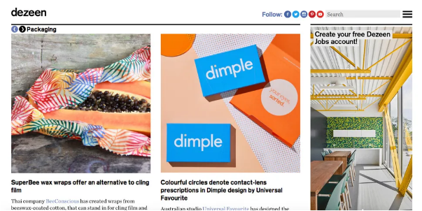
Dezeen is best known for architecture and interior design, but it also covers product and packaging design—especially the cutting-edge, experimental stuff. If you’re into sustainable packaging or innovative materials, this is the site for you. It’s a great way to stay ahead of emerging trends.
05. Behance
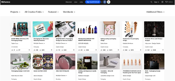
If you’re a designer, you probably already know Behance—but it’s worth mentioning here anyway. This online portfolio platform features packaging projects from artists of all skill levels, covering everything from shoes and pharmaceuticals to alcohol and electronics. New work is added constantly, so you’ll never run out of ideas.