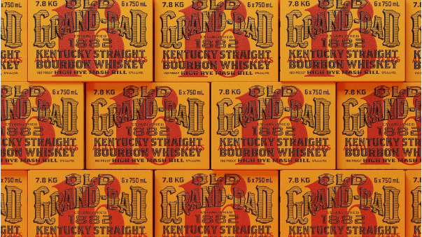
When it comes to bourbon branding, striking a balance between heritage and contemporary flair is everything—and the James B. Beam Distilling Company nails that balance with its latest release: Old Grand-Dad 16 Year. This 100-proof, limited-edition bottling (a one-time-only run, no less) is a masterful example of legacy-driven design, blending timeless appeal with fresh energy.
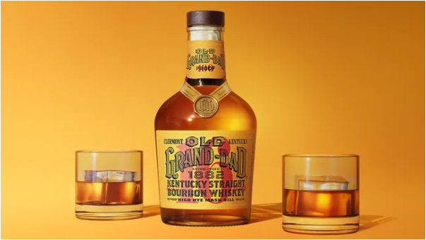
Old Grand-Dad isn’t just another bourbon—it’s Beam’s longest-standing label, tracing its roots all the way back to 1882. For this special 16 Year release, the packaging leans into that rich history while feeling totally current: think pre-Prohibition-era charm mixed with sleek, modern touches. The design lets small, thoughtful details shine, all while keeping the label’s focus on bold, clean typography—no over-the-top flourishes to distract from what matters.
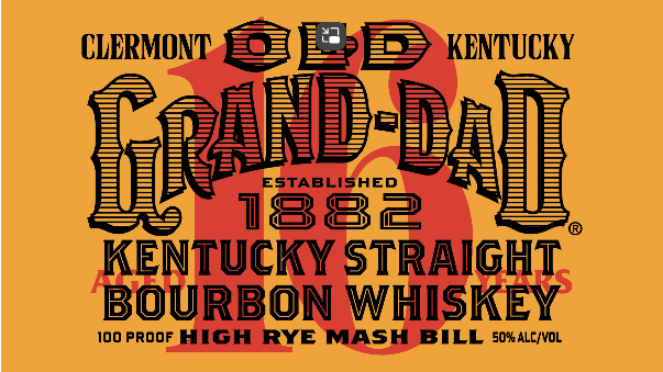
Beam didn’t tackle this design alone; they partnered with Tavern, a Brooklyn-based branding agency known for blending old and new. The result? A bottle that feels both nostalgic and fresh. Standout details include a bold red age designation, inspired by the stamping styles of pre-Prohibition whiskey bottles, and a warm yellow base color pulled straight from Old Grand-Dad’s vintage archives. Even the bottle’s shape pays homage to the past: its neck takes cues from Old Grand-Dad 114’s packaging from the 1980s and ’90s.
“In approaching this design, we took a ‘modern heritage’ mindset—diving into the brand’s archives to pick out the best old and new elements to mix together,” Mike Perry, Tavern’s founder and chief creative officer, said in a press release. “Every choice was guided by the bourbon itself: it’s bold, it’s prestigious, so the design had to match that. We went with a stripped-back, type-focused look to keep it modern, which let the smaller design details really stand out.”
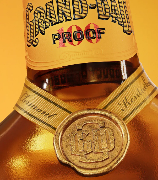
To stay true to Old Grand-Dad’s legacy, Tavern reimagined the brand’s classic wordmark: instead of a solid black fill, they used a textured hatched pattern. The Western-inspired typography pairs perfectly with little bits of text that shout the bourbon’s identity: “Established 1882,” “High-Rye Mash Bill,” “Clermont, Kentucky”—small nods to history, quality, and authenticity. And for that luxury feel? The bottle gets polished touches like a wax seal, a ribbon, and a subtle raised sheen on the black text. To keep things from feeling too old-fashioned, there’s also a sleek OGD monogram that adds a crisp, modern finish.
Curious to see more of Tavern’s work? Check out the agency’s custom wine branding—spoiler: it’s just as stunning as you’d imagine.