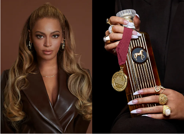
Fresh off the massive success of her Cowboy Carter album earlier this year, global music icon Beyoncé has launched her very own whiskey brand—one that draws deep inspiration from her Southern heritage. Named SirDavis, this masterfully crafted spirit stands out thanks to its polished design, setting it apart from the usual celebrity-endorsed alcohol offerings. It’s a move that proves “Queen B” is far more than a one-trick pony.
Rooted in heritage, SirDavis is a love letter to Beyoncé’s cultural roots, blending timeless design with modern sophistication. Whiskey packaging often falls back on tired conventions, but SirDavis breaks the mold: its one-of-a-kind bottle isn’t just a container—it’s a decorative statement piece, meant to signal that this is a luxury sip worth savoring.
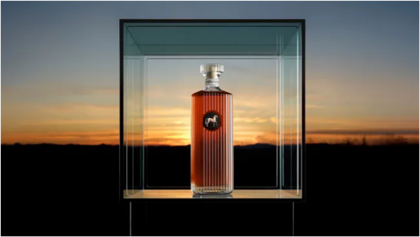
Developed in partnership with spirits giant Moët Hennessy, Beyoncé’s custom whiskey exudes elegance from every angle. The fluted glass bottle is topped with a striking, gold-accented horse emblem—a design first seen on the iconic Cowboy Carter album cover. This stylized horse isn’t just for show; it’s a tribute to the legacy of Black rodeo culture, a recurring motif that weaves through the whiskey’s entire brand identity. Even the name “SirDavis” holds personal weight: it pays homage to Beyoncé’s great-grandfather, Davis Hogue, who found success as a moonshiner during Prohibition.
Complementing the bottle’s bold details is a sleek, understated serif wordmark. A subtle twist—deconstructed details on the letter “A”—adds a modern vibe without clashing with the brand’s classic feel. As for the whiskey itself? It’s a sophisticated blend inspired by Japanese distilling traditions, boasting a timeless appeal that transcends cultural and traditional boundaries. Every drop lives up to the elegance of its packaging.
Celebrity-backed product branding spans a wide range, but it works best when it feels authentic to the creator. Take Chef Matty Matheson’s retro food packaging, for example—it’s practically on the opposite end of the style spectrum from SirDavis, yet its unassuming, down-to-earth design only amplifies its genuine charm. If you’re craving more design inspiration, check out this delightful tomato packaging: it’s a perfect example of how to inject fun back into food-focused product design.