Fun packaging design is making a much-welcomed comeback—finally.
These days, with modern minimalism dominating so much of design, it’s easy to forget that creativity can still feel playful. Leading the charge for fun, imaginative packaging? None other than tomato brand Tomatier Snacks, which has stepped into the spotlight with a delightfully fresh look that leans into the more playful, silly side of branding.
In a crowded market where sleek, monochrome packaging is everywhere, it’s tough to make a mark—especially when your product is something as simple and familiar as a tomato. But Tomatier stands out with a refreshingly playful vibe, carving out a unique identity that isn’t afraid to break trends if it means making design feel joyful.
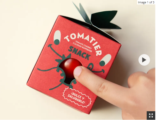
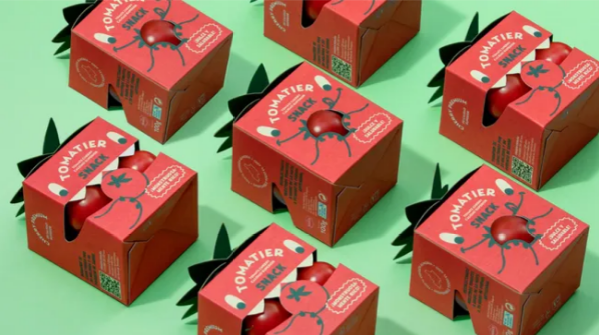
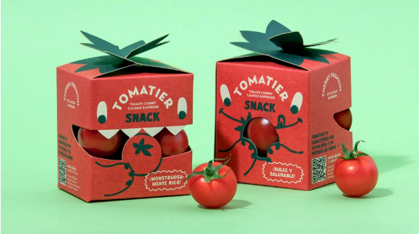
The stylish packaging comes from Meteorito, a design studio based in Valencia, and it’s made to capture the attention of both kids and parents. The compact square boxes are oozing with personality, featuring a lineup of monster characters with adorable, illustrated faces. Even just from the visuals, you can tell how closely the packaging ties to the product: it pulls design cues straight from cherry tomatoes, like the bright red color scheme and the little leaf detail on the box closure.
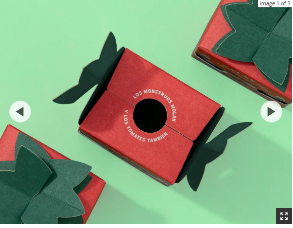
It’s a thoughtful design that balances fun with functionality, too—they’ve even used the monsters’ mouths as little windows to show off the tomatoes inside. Tied together with the straightforward slogan “Monsters are cool and so are tomatoes,” the whole look is a lighthearted, creative example of thematic branding that feels down-to-earth and totally endearing.