App user interface (UI) design, much like web design, evolves through countless phases. When the iPhone first hit the scene, most apps stuck closely to Apple’s Human Interface Guidelines. But as the device became ubiquitous—and Apple itself rolled out more of its own apps—UI design branched off in all sorts of directions.
Whether it’s the rise of skeuomorphism or the shift toward clean, graphic interfaces, 2012 was a year for UI designers to dive into experimentation, craft fresh approaches, and still keep their apps usable at their core. We combed the App Store and beyond to break down the biggest UI design trends of 2012…
01. Skeuomorphism
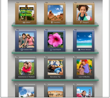
Love it or hate it, skeuomorphic UI was on everyone’s radar in 2012—largely thanks to Apple’s own iOS apps. Think the shelves and photo albums in Apple’s iPhoto, or the leather-bound look of Find My Friends: those are classic examples. But other apps took the concept even further (and nailed it), like Korg’s iMS-20 iPad app. Brushed aluminum, weathered leather, and wooden shelves were all go-to touches for skeuomorphism. The catch? Sometimes designers went overboard, creating interfaces that clashed with the sleek devices they ran on. Apple’s own Podcasts app that year was a perfect example of this misstep.
02. Retro/Vintage Vibes
Hipstamatic is probably the most famous retro app, but there were tons more—CameraBag, Infinicam, and others—that drew inspiration from the past. Think fake wear-and-tear, aged interfaces, and even nods to devices that look like they’ve been stashed in an attic for 20 years (that was a big favorite). Of course, function still shaped form for many of these. Take Pocketbooth: it mixed 1950s-style typography with soft pastels and wood/metal textures, and it worked beautifully. LetterMpress and Flick Kick Soccer are solid examples too.
03. Notebooks & Digital Pages
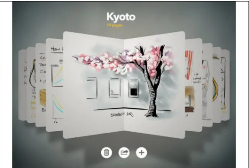
This could technically fall under skeuomorphism, but 2012’s Paper by FiftyThree app gave the “digital book” idea a more minimalist twist. No leather covers or ring binders—just pages and sketchbooks you navigate using familiar iOS gestures. You saw this same concept in apps like Evernote and even Apple’s Pages: all let you flip through documents in a way that feels intuitive, like flipping a real book.
04. The Grid Layout
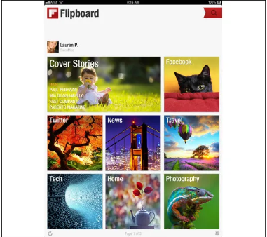
Sure, it’s not a new idea, but the grid approach stayed just as popular as ever for iPhone and iPad apps in 2012. Look at Instagram’s Explore tab: it’s just a grid of eye-catching images that pull you deeper into the app and its community. Or the Cool Hunting app—even Flipboard for iPhone used this. The news reader Pulse was another standout example of how effective grids can be.
05. The “Instagram Effect”
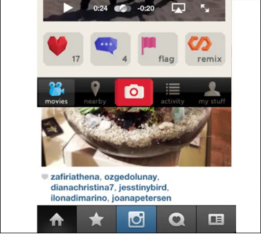
A clear trend popped up: tabs along the bottom of the screen, with a bigger (or more noticeable) button in the middle that leads to the app’s main feature. For Instagram, that’s the camera button. The number of apps that copied this was crazy—and for good reason: it works. Think Pinterest, Path, Color, Foursquare, Foodspotting, Vyclone… the list goes on.
06. Wood Textures
If 2012 had a “year of the texture,” it would be wood. Pair it with familiar iOS buttons, bold slab serif fonts (like the one in Zolmo’s Jamie’s Recipes app) and subtle skeuomorphic touches, and this background could shine. Take the Webr app: it mixed a wood background with sleeker elements, and the contrast worked really well.
07. Pull-to-Refresh
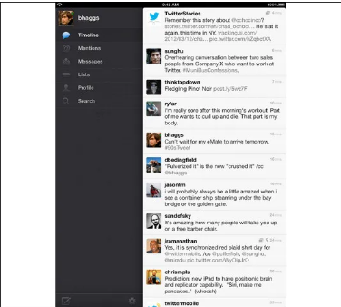
By 2012, users just expected to pull down the whole interface to refresh content. This feature blew up with Tweetie for iOS—now the official Twitter app, ever since the social media giant bought it from atebits in 2010. By 2012, it was basically a must-have for apps with constantly updating streams (like social feeds or news). You could find it in Facebook’s iOS app, and even the new native Mail app in iOS 6 (which launched later that year).
08. Clean & Intentional Design
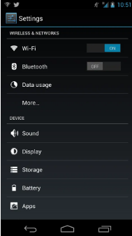
As phone screens got better—with pixels so tiny you could barely see them—designers gained more control over fine details. That’s probably why skeuomorphism got so popular. But 2012 also showed that a clean, digital look could be just as impressive—take Android 4.1 Jellybean. Look at its Settings icon, or the white-on-black options that follow. Or the Lock icon that pulses under your finger when you choose to unlock to the home screen, camera, or Google Now. It’s clean, structured, intentional—and there’s not a single beveled edge or extra texture in sight.
09. Hidden Navigation
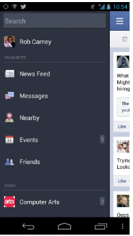
With only so much space on iPhone and other mobile screens, designers were always figuring out how to guide users to the content that matters. Hidden navigation became a go-to solution. Take the Facebook app: your feed takes up the whole main screen, but tap the top-left navigation button, and a menu slides in—giving you access to messages, events, friends, pages, and more. This replaced the old grid of icons from earlier versions. Android and iOS both used this trick too: dragging down notifications from the top of the screen. When done right, hidden navigation keeps users focused on the app’s main feature without clutter getting in the way. Path nailed this too.
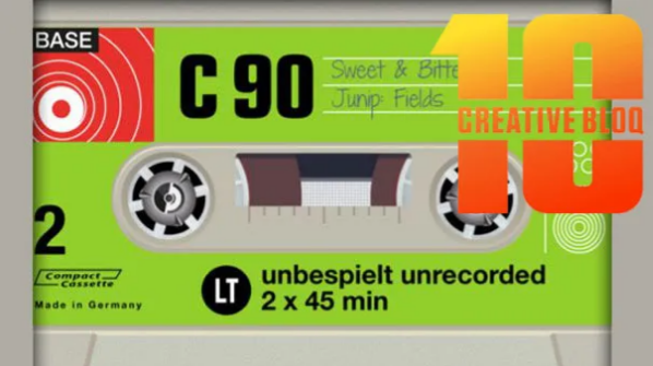
10. Laser-Focused Apps
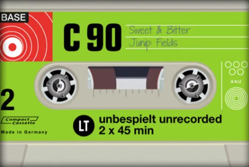
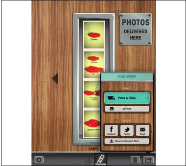
2012 saw tons of apps that did one simple thing—and did it right. Their UIs varied based on what the app did, but they all had one thing in common: just one or two screens, with the main screen front and center while the app works. Take AirCassette: it’s totally skeuomorphic, but it only does one thing—play your music while showing the track name on a retro cassette. No extra fluff.
11. Playful Illustrations
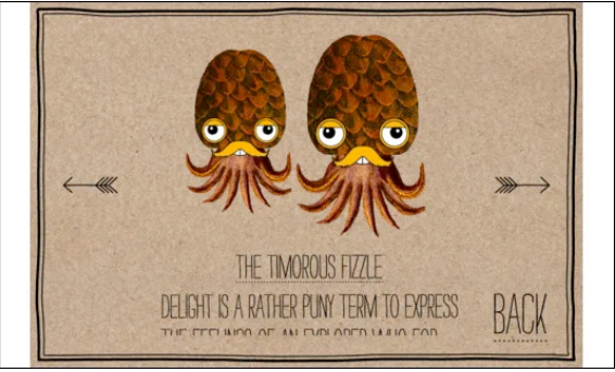
Game design was where UI designers really got to experiment in 2012. We saw some super original UIs, like the stunning Whale Trail and the charming Sir Benfro’s Brilliant Balloon. The latter was unlike anything else on the iPhone: a vibrant interface with whimsical characters scattered across the screen, plus hand-drawn typography that made navigation simple but stylish.
12. Photo-Realistic Icons
Your app’s icon is how users spot it on their home screen—so it’s a big deal. By 2012, icons that were hyper-realistic but still stylized (and clearly showed the app’s purpose) were everywhere. Instagram’s icon is a great example, as is Facebook Camera. Another standout: Physique, designed by Roman Jusdado. (You can even find tutorials online to make your own.)
13. Notification Boxes
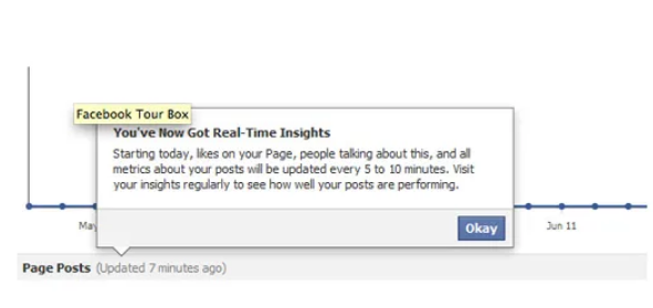
You know the ones: those square speech bubbles (what folks call “pop-up modal boxes”) that appear when you tap a button. This shape took over UIs in 2012—and it’s easy to see why. It works: it gives users context-specific info only when they need it, so it doesn’t clutter the screen.
14. Buttonless Design
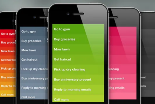
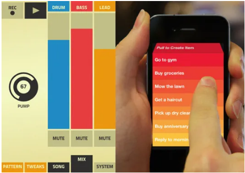
2012 might just mark the start of sleeker, buttonless UI. It’s the total opposite of Apple’s skeuomorphic style—leaning into what devices really are: digital tools. A perfect example? Realmac Software’s Clear, a to-do list app that uses simple gradient rectangles and familiar iOS gestures to work beautifully. Expect more minimalist, gesture-driven apps like Clear in the coming year—designers and developers were starting to get tired of the over-the-top skeuomorphic apps that had dominated since Apple popularized the style.
15. Fresh Takes on Buttons
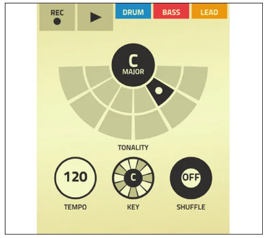
Designers also got creative with button design in 2012. We’d all seen the skeuomorphic button trick a million times, but apps like Figure (a music-making tool) showed a new way. Figure needs buttons, but it presents them in a flat, graphic, animated style—easy to use and visually appealing, no extra textures required.
16. Icon Labeling
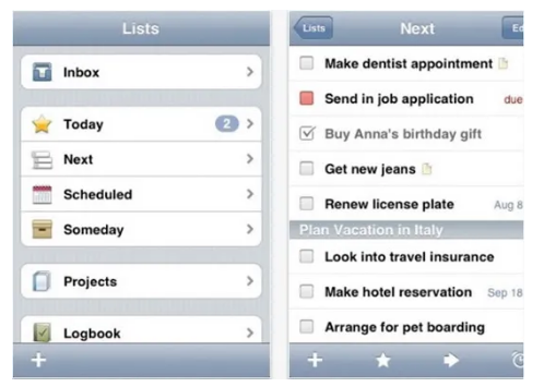
Unlike the last two trends, pairing icons with labels (to explain what a button does) stayed super popular in 2012. Why? It spruces up the app’s look (especially for list-heavy designs), and let’s be real: people don’t read every little thing on their screens. Putting an icon next to a list item helps users jump straight to what they want. Most to-do apps did this well—like Things.
17. Big Buttons for Little Hands
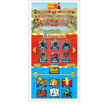
The iPhone and iPad turned out to be awesome tools for kids—for learning, playing, or both. When designing for kids, you need interface elements that are super simple, easy to understand, and almost always huge. Great examples include Bob the Builder’s Playtime Fun, Postman Pat SDS, and Fireman Sam – Junior Cadet—all made by P2 Games, a specialist in kids’ apps.
18. Metro Minimalism
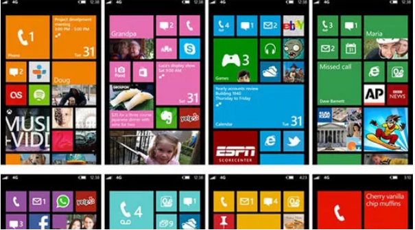
Windows Phone 7 (and soon WP8) dialed back the shine that had taken over UI design in recent years, keeping things simple. Shiny icons were replaced with functional flat-colored squares. It’s a smart, well-thought-out design—quirks and all—and it’s undeniably sleek and usable. WP7 apps follow the Metro Design Language, which gave users a consistent experience across the platform—something mobile devices hadn’t really nailed before.
19. Typographic Navigation
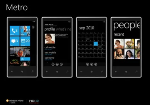
Metro also brought in typographic navigation—something that’s been pretty rare on mobile devices until now. Text stretches across multiple screens, hinting at where you came from and where you’re going next. We expect more designers to bring this style to apps outside the Windows Phone 7/8 world soon.
20. The “Break the Trend” Trend
While Windows Phone focuses on Metro consistency, iOS and Android gave designers endless chances to get creative. Sure, trends stick around because they work, and more “outside-the-box” UIs need lots of user testing. But 2012 showed that a unique approach could set an app apart—and give users an experience they’d come back to. Take music app Figure and to-do app Clear: they break the rules, but they’re still super intuitive and fun to use.