Liquid Glass just got a subtle yet welcome glow-up.
Rolling out a new iOS update is rarely a smooth ride. Apple typically kicks things off with a flashy keynote reveal, only to follow it up with months of beta testing—a phase where developers and eager iPhone users dig into every nook and cranny of the software. Inevitably, bugs, clunky spots, and design missteps start to surface. For iOS 26, though, Apple seems to be paying extra attention to user feedback—and it’s already making a difference.
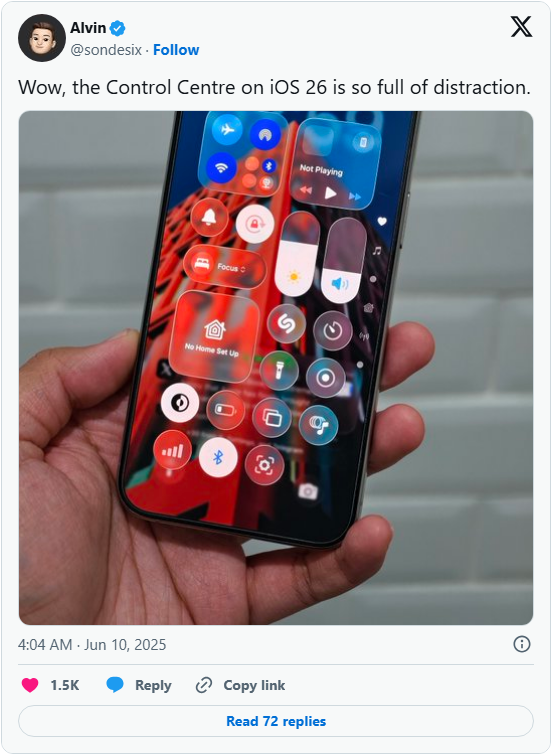
Since its debut earlier this month, Liquid Glass—the fresh design language Apple is introducing with iOS 26—has been grabbing headlines. Its transparent elements and bold animations have sparked plenty of talk (and even a few jokes) online. But for early beta testers, one specific detail stood out as more frustrating than the rest.
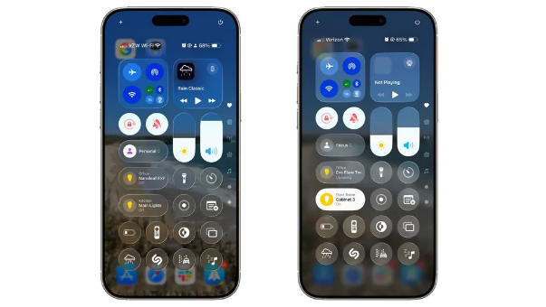
The problem? iOS 26’s Control Center. Early versions were panned for being too transparent; the vibrant icons on users’ home screens peeked through so prominently that they became a major distraction. The whole setup felt disjointed—until Apple stepped in with tweaks in the latest iOS 26 beta.
Now, the improvements are clear: Apple cranked up the blur effect, which softens those distracting background icons, and toned down the transparency of the Control Center’s own buttons. The result? A Control Center that’s far easier on the eyes and feels more cohesive.
It’s still too early to say how many more fixes Apple will roll out as the beta process continues. Historically, the final version of iOS often looks quite different from the first beta developers get their hands on. But one thing is certain: iOS 26 is shaping up to be the most significant redesign of iPhone software we’ve seen in years.