A seasonal candle from Bath and Body Works has landed the popular retailer in hot water, all due to an unfortunate design misstep. The brand’s “Snowed In” candle was quickly pulled from shelves after consumers pointed out a controversial detail: its design appeared to feature white hooded figures, drawing uncomfortable and unsavory comparisons.
There are no strict, one-size-fits-all rules for product packaging design—but this incident is a stark reminder that the internet doesn’t miss a thing, even in seemingly harmless designs. I don’t believe Bath and Body Works had any ill intent with the “Snowed In” candle’s packaging. Still, it’s a crucial lesson for any brand: always gather multiple perspectives before finalizing a design.
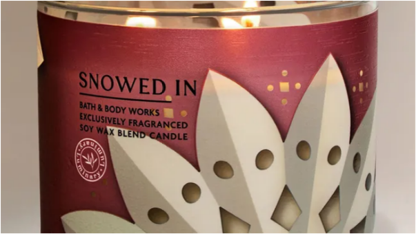
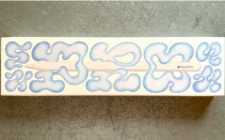
The problematic candle sported a white paper snowflake design, complete with sharp, pointed edges. But two small circles on the design, intended to be part of the snowflake’s pattern, were unfortunately interpreted by many as eye holes—evoking images of hooded figures. While the design was clearly meant to fit the brand’s cozy, winter-themed candle lineup, it failed to resonate with fans looking to get into the holiday spirit.
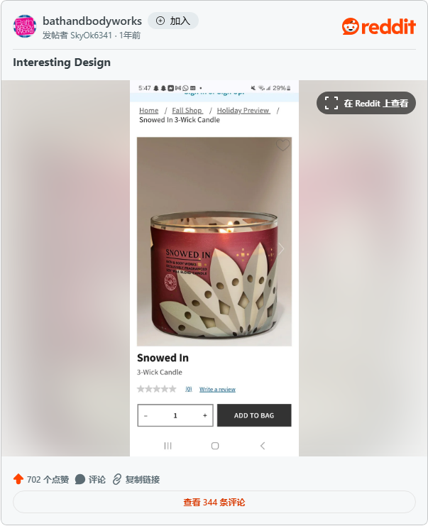
The issue first gained traction on the r/bathandbodyworks subreddit, where one user shared a photo of the candle with a caption that summed up the collective reaction: “I get that it’s supposed to be a paper snowflake, but I can’t be the only person who sees that, right… RIGHT??” Others were quick to agree, with comments pouring in to back up the original poster. “Is this the Klan Krismas Kandle?! Hard pass, ma’am,” one user joked (though the tone carried frustration), while another added, “This is so creepy and ugly—and yeah, I definitely see what you’re talking about.”
As CNN reported, Bath and Body Works addressed the backlash with a statement, emphasizing accountability: “At Bath and Body Works, we prioritize listening to our teams and customers—and we’re dedicated to fixing any mistakes we make, even unintentional ones like this. We apologize to anyone we’ve offended, and we’re moving quickly to remove this item from all channels. We’re also reviewing our design approval process to prevent issues like this from happening again.”
Design mishaps are far from rare in the retail and branding world. From ongoing design debates surrounding X (formerly Twitter) to the absurd logo controversy involving Lyle’s, the industry is full of examples where small oversights spark big reactions. These missteps aren’t a matter of “if” they’ll happen—they’re a matter of “when.” The best brands can do is own up to their mistakes, apologize sincerely, and use the experience to do better next time.