
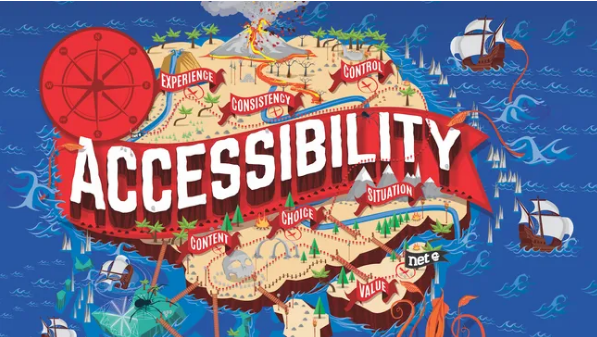
6 Steps to Ensuring Your App Works for Everyone
Under the Americans with Disabilities Act (ADA) and other U.S. guidelines, public-sector websites and apps are legally required to be accessible to all users—and this standard is increasingly becoming a best practice for private businesses too. In today’s digital world, mobile apps are a go-to way for companies to connect with customers, offering greater convenience on the move than traditional websites, whether for business, education, or entertainment. For quick, actionable solutions to boost accessibility, be sure to check out our post on free accessibility tools.
Making your app accessible means accounting for the diverse challenges users may face, so as many people as possible can engage with it. This includes individuals with visual impairments, motor limitations, cognitive or learning differences, and deafness or hearing loss.
Designing an accessible app isn’t just about making the interface “clearer”—it’s about building flexibility into your design to support users across the accessibility spectrum, including those who rely on assistive features. Below, we break down six key factors organizations should prioritize to create an app that’s truly accessible to all.
If you’re building a website instead of an app, you’ll want to invest in top-tier website builders and reliable web hosting services to keep it accessible too.
01. Build a Simple, Uncluttered Layout
The first step is to keep your app’s layout straightforward. A messy, overcrowded interface can overwhelm users, leading many to abandon your app before they’ve even explored its core features.
Crucially, your design must be responsive—elements should remain visible and functional when users magnify their screens, and the layout should adapt seamlessly to different device sizes. Text and call-to-action (CTA) buttons should also be appropriately sized by default, with a built-in option to enlarge them without distorting the rest of the interface.
02. Design Consistent Navigation
Your app should be easy to follow, with clear cues to guide users. Navigation should have short, intuitive task flows (e.g., minimizing the steps to complete a purchase or sign up) and be consistent across every part of the app. This is especially important for CTAs: they need clear, descriptive labels (e.g., “Submit Payment” instead of “Click Here”) to help users move toward your app’s goals without confusion.
Navigation tools—like menu bars, search boxes, and back buttons—should also be placed in the same location and follow the same format throughout the app. This consistency lets users learn your app’s structure quickly, so they can navigate logically without reorienting themselves at every step.
03. Prioritize Readable Text Formatting
Text is a core part of most apps, so its design needs careful consideration—especially for users with dyslexia, who may struggle with inaccurate reading or processing text.

Avoid features that hinder readability: uneven spacing between words or lines, overly long sentences/paragraphs, and excessive italicized text. Color choice matters too—low-contrast text (e.g., light gray on white) is hard to read for users with visual impairments. Keep formatting simple and consistent across the app to reduce cognitive load and make text accessible to everyone.
04. Make Audio and Video Accessible
Adding interactive media (like videos or audio clips) can enhance your app—but it also creates accessibility risks if not handled properly. The key is to give users control and provide alternatives for different needs.
When including audio or video:
- Let users pause, stop, or adjust volume at any time (no auto-playing media without controls).
- Add closed captions for video and transcripts for audio (critical for deaf or hard-of-hearing users).
- Include audio descriptions (narration of visual elements) for video to help users with visual impairments follow along.
If media feels like an unnecessary add-on that could create barriers, explore other interactive features (e.g., interactive infographics) that are easier to make accessible. And if you’re building an app with heavy media assets, use reliable cloud storage solutions to keep files secure and ensure smooth performance for all users.
05. Choose Colors Mindfully
Color palettes are a big part of branding— but relying only on color to communicate information (e.g., red for “error” or green for “success”) excludes users with color blindness (who may not distinguish between these hues).
This doesn’t mean ditching color altogether—brand-aligned colors are still important. Instead, pair color with other visual cues: for example, add an “X” icon next to red error messages or a checkmark next to green confirmations. Also, test your color palette to ensure high contrast (tools like WebAIM’s Contrast Checker can help) so users with low vision can easily interpret on-screen information.
06. Don’t Skip Accessibility Testing
Following guidelines (like the Web Content Accessibility Guidelines, WCAG 2.1) is a great start—but treating accessibility as a “check-the-box” task won’t guarantee your app works for real users.

Test your app in multiple ways:
- Recruit diverse users (including those with disabilities) to test the app and share feedback—their firsthand experiences will reveal barriers tools might miss.
- Use digital tools (like screen readers, keyboard navigation testers, or accessibility scanners) to identify technical issues (e.g., buttons that can’t be accessed via keyboard).
Designing an app is a chance to build a creative, powerful platform for your business—and accessibility shouldn’t hold that back. Instead, it’s an opportunity to expand your audience, build trust, and create a brand image that resonates with all users. By prioritizing these six steps, you’ll make an app that’s not just compliant, but truly inclusive.