I can’t pinpoint the first time I saw a Drew Struzan poster, but I’ll never forget how it made me feel. It hit me right in the gut. Long before I knew the storyline or characters—before I’d even watched a single scene—I was already captivated.
This week, the legendary artist and designer passed away at 78, after a long fight with Alzheimer’s. Directors like Steven Spielberg, George Lucas, and Guillermo del Toro have been sharing their tributes. And for many of us who grew up in the ‘80s and ‘90s, his loss feels deeply personal.
That’s because Drew Struzan’s posters weren’t just ads to get us into theaters. They were part of the magic of the movies—and remain some of the greatest posters ever created.
The Power of Anticipation
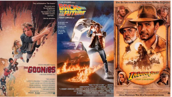
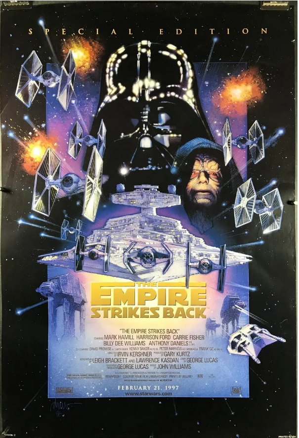
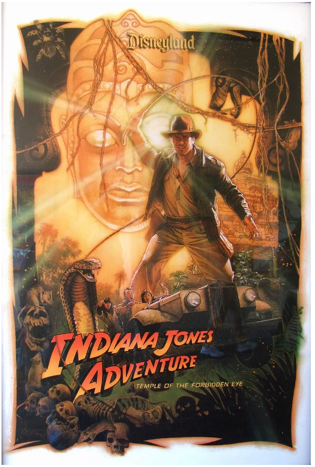
At first glance, Drew’s work looks almost photographic. But look closer. There’s something more—the lighting gives it away. That soft glow around Harrison Ford’s fedora in Indiana Jones and the Last Crusade, or the heavenly light behind Michael J. Fox in Back to the Future. It isn’t just light—it’s a promise. A sign that something incredible is about to happen.
I miss that feeling. A lot.
Today, so many movie posters feel like empty Photoshop collages. They’re functional: they show you the genre and which celebrities star in it. But that’s where it ends. (If you take a look at the worst posters of 2024, you’ll know exactly what I mean.)Drew understood something deeper. A poster isn’t just an advertisement—it’s the opening act. It sets the tone. His art didn’t explain the movie; it made you feel what the movie would be like.
A Style Forged by Struggle
The story of how Drew developed his style says everything about the man. As a broke art student in LA, he couldn’t afford to waste paint. So he learned to use it sparingly, thinning his oils to unusual transparency, building color through layers. Poverty taught him restraint—and restraint became elegance.
For six years, Drew attended the ArtCenter College of Design, often getting kicked out for late tuition, only to sneak back in through a side door. He sold homework assignments to other students just to scrape by. Some weeks, he ate only twice—when visiting his girlfriend, Dylan. The rest of the time, he spent his food money on art supplies.
I’m not trying to romanticize hardship—it was brutal. But his commitment highlights something we’ve lost in today’s risk-averse creative culture: the power of going all-in. Drew didn’t have a backup plan. He couldn’t afford one. Failure wasn’t an option.
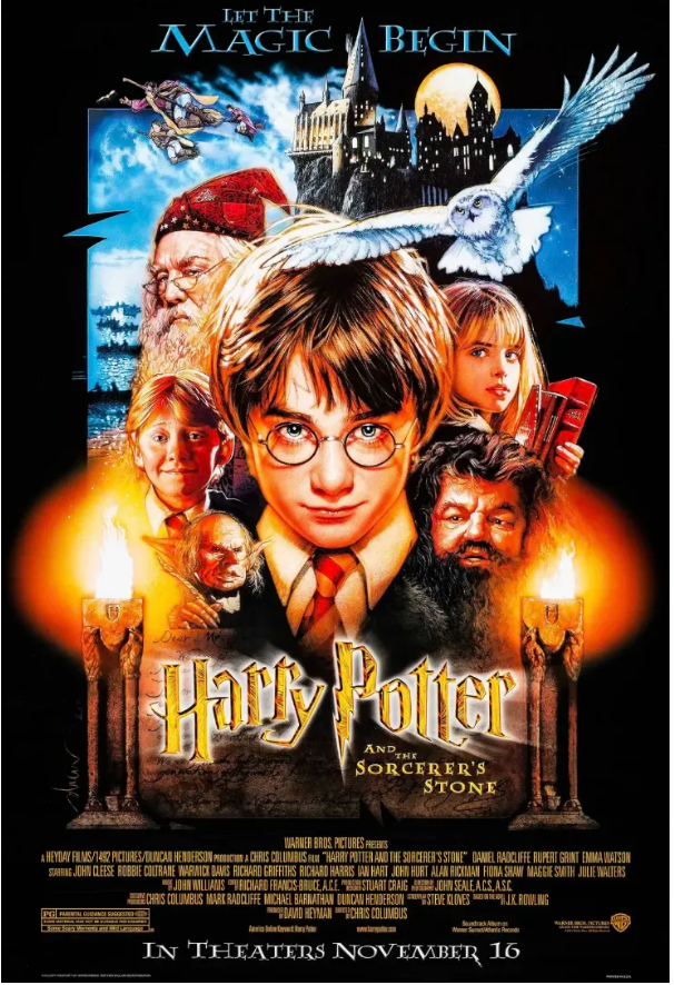
Years later, his iconic “mountain of people” poster design solved a problem that still stumps designers: how to showcase a large ensemble cast without creating visual chaos. Drew used hierarchy and atmosphere. Key faces glowed; others faded into shadow. Your eye always knew where to go.
An Era Replaced by the “Safe”
To me, Drew’s art helped define what now feels like a golden age of blockbuster cinema. Maybe it’s just me getting older, but it seems like today that level of passion, craftsmanship, and attention to detail is fading.
Walk by any multiplex now and you’ll see what replaced it: rows of celebrity faces, generic teal-and-orange color schemes, and safe font choices made by committee. Everything feels focus-grouped. Everything feels forgettable.
It’s easy to blame technology—digital tools allow endless tweaking, and AI is making things even faster. But as the old saying goes, a bad carpenter blames his tools. We’ve forgotten that creativity requires risk. That style matters. That a great poster shouldn’t just show you who’s in the movie—it should tell you why it matters.
Drew didn’t work from spreadsheets. He wasn’t optimizing for demographics or making actors’ agents happy. He wanted you to feel something. Everything else flowed from that.
He will be deeply missed.