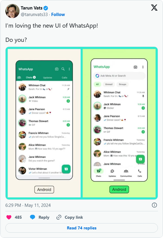
WhatsApp’s latest user interface (UI) overhaul brings a crisp, modern vibe—and Android users will notice it bears a striking resemblance to the iOS version.
The update leans into a revamped color scheme, polished icons, fresh illustrations, and lively new animations, plus updated chat wallpapers—all coming together to create a far cleaner look that puts the app’s signature green front and center. That green pops up strategically: it adds a subtle accent to notification badges and buttons, but never overwhelms, since it’s layered over calm, neutral base tones. Icons and illustrations also get a softer touch, with more rounded edges that feel approachable.
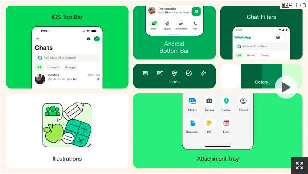
We first covered this new UI back when it was in beta testing, and now it’s finally rolling out to all users. For Android, one of the biggest changes is the navigation bar—now moved to the bottom of the screen, just like on iPhones. This makes accessing key tabs (Chats, Calls, and Status) a one-handed breeze, cutting down on stretching to reach top-of-screen controls.
Meta, WhatsApp’s parent company, has put serious thought into the details: the team tested over 35 different color variations before landing on the final palette. Dark mode gets an upgrade too—it’s now a deeper shade with boosted contrast and richer tones, designed to ease eye strain when using the app in low-light spaces. The search bar also gets a new home: it’s now at the top of the Chats tab, making it faster to find old messages or specific contacts. Some users will even get early access to Meta AI, integrated directly into the app.
Judging by social media reactions, the new design is mostly a hit. Users are praising its cleaner, more up-to-date feel—but there’s a split: a handful are asking whether an AI chatbot really adds value to a messaging app, questioning if it’s a useful tool or just extra clutter.