In this extract from Jeffrey Ludlow’s book of essays, titled A Sign…, he explores how donor signs on cultural institutions symbolise power and wealth, but also sometimes controversy
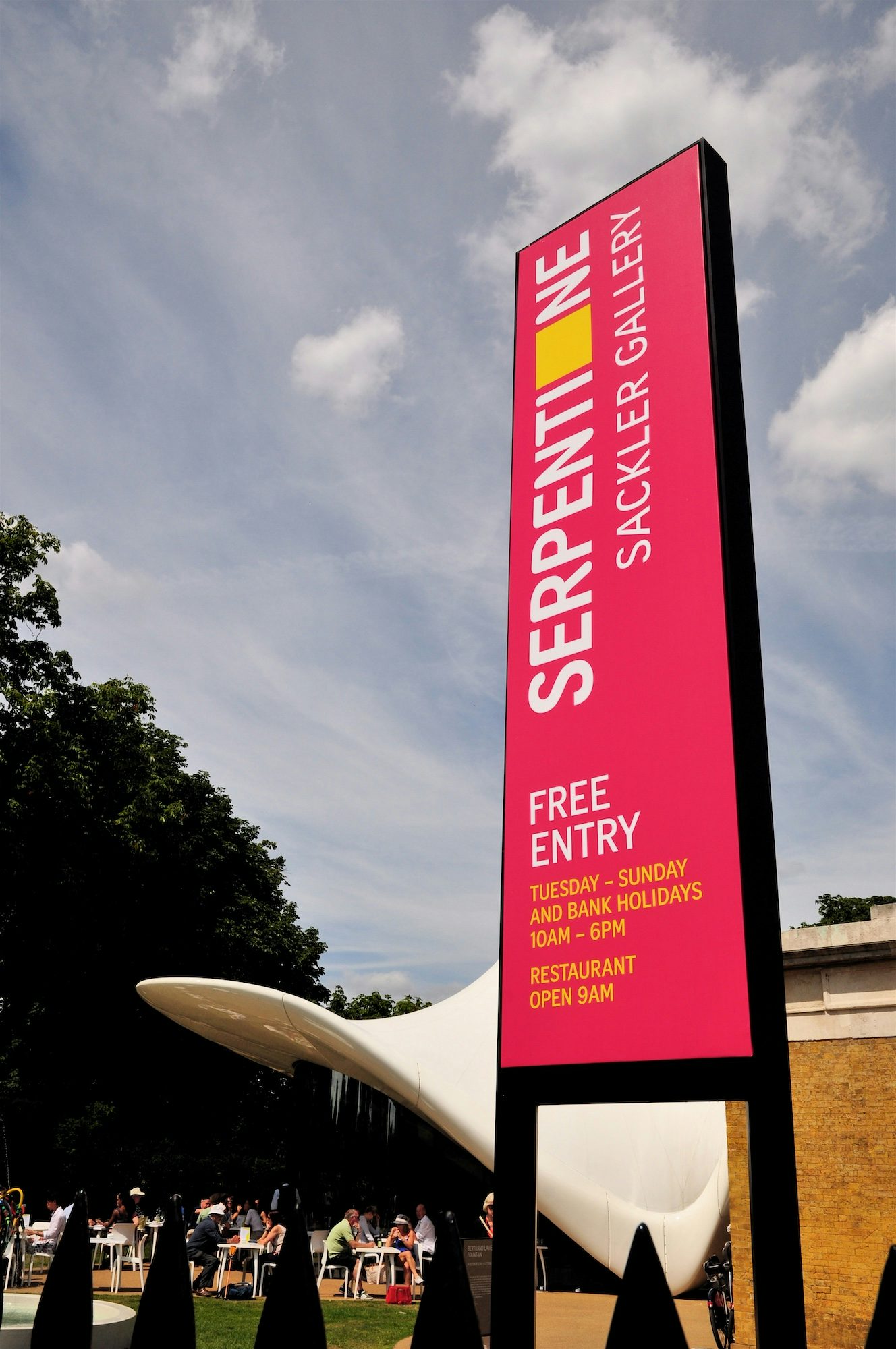
The halls, doorways, and walls of nearly every American cultural institution are lined with what are essentially tags. These are not the colourful spray-painted graffiti tags that pepper the urban landscape, but names of wealthy families memorialised in stone.
A visual survey of museums, campuses, and medical facilities will reveal that many key architectural elements — whether it be a wing, a fountain, a plaza, or an entrance hall — have been allocated to the highest bidder and elegantly captioned by what is called donor signage. Names on the wall are so common in the cultural sphere that likening them to graffiti is hardly a stretch.
One reason behind this is that since the turn of the millennium, the rich have gotten richer faster than at any other time in history, and charitable donations have grown in pace. When the investment luminary Warren Buffett pledged $36 million to the Bill & Melinda Gates Foundation in 2006, it became the largest donation on record, eclipsing the combined giving of John D Rockefeller and Andrew Carnegie — even when adjusted for inflation. In this golden age of philanthropy, it has been estimated that the majority of all donations come from individuals.
Despite the current unprecedented heights of institutional giving, the concept is not new. The patronage template was established by the Gilded Age industrial magnates of the late 19th century, led by the Morgan, Carnegie, Rockefeller, and Ford families who amassed their fortunes in steel, oil, railroads, telegraphs, and automobiles. This so-called ‘robber-baron’ generation was famed for its cutthroat business practices as well as for its massive generosity to hospitals, universities, and cultural institutions.
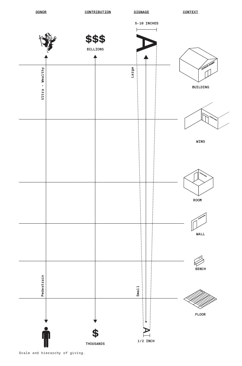
Public donations not only elevated the families’ social status within the old-money hierarchy but — more insidiously — diverted attention from any misconduct perpetrated while acquiring such massive fortunes. The philanthropy of the Gilded Age was impactful in size, limited in scope, and nearly silent from a donor signage perspective.
Today’s philanthropic landscape is marginally less white and male than the Gilded Age, but it is still wracked by the same tensions between old and new money. Freshly minted technology and pharmaceutical fortunes continue to jockey for altruistic status with traditional blue-blooded lineages. What is vastly different now is the magnitude and depth of the new ‘philanthrocapitalist’ class. The number of billionaires has ballooned to over 2,500 from just a dozen or so in the Gilded Age, and charitable donations have expanded in turn.
Private giving from individuals, foundations, and businesses reaches nearly half a trillion dollars a year, primarily destined for cultural institutions, universities, and hospitals. While that may seem like an unequivocal win-win, the downside is that less than 5% of the bonanza goes to charities addressing more divisive social issues like poverty, inequality, and homelessness.
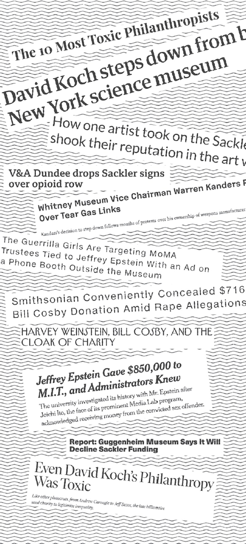
The institutions on the receiving end of this philanthropy have sophisticated development departments that cater to existing patrons and scout potential new leads. They also create the tiers of recognition that separate the whales ($$$$) from the minnows ($), divisions that are primarily expressed through donor signage. This somewhat dark art consists of balancing wealthy patrons’ egos through the typography, grandiosity, and location of their names on buildings.
The disparity between naming a wing and an individual brick paver is a clear physical representation of the heft of the gift, but the same is true on a much more meticulous scale — a centimetre difference in font size could indicate a differential of millions or billions of dollars. This philanthropic graffiti is more than a simple status symbol for a donor; it becomes a means of societal rebranding. As was true in the Gilded Age, a few pet causes and board seats can transform a donor’s reputation from a ruthless entrepreneur to a noble altruist and societal saviour.
As a result of protests, institutions fearing increased levels of public scrutiny and ‘cancellation’ have chosen to quietly distance themselves from toxic patronage
However, like its cousin graffiti, donor signage is also susceptible to being removed or buffed out. What makes these public symbols so recognisable and visible is also what makes them a target and focal point for protest. Starting in 2015, institutions have been responding to public pressure by removing the names of donors whose charitable dollars were dubiously sourced.
The most noteworthy example of this is the ‘de-Sacklering’ of museums like the Louvre, the Serpentine Galleries, the Victoria and Albert Museum, the Solomon R Guggenheim Museum, and the Metropolitan Museum of Art. After protestors used increasingly public acts of outcry to bring attention to the Sackler family’s primary role in creating and perpetuating the opioid crisis, institutions quietly removed any traces of their names from their buildings.
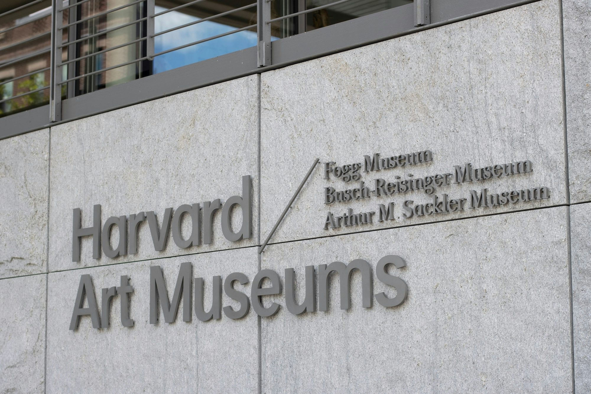
As a result of these protests, recipient institutions fearing increased levels of public scrutiny and ‘cancellation’ have chosen instead to quietly distance themselves from toxic patronage. The ghosting of a donor sign and cutting ties remains their best method for gaining institutional distance from tainted benefactors.
Given the enormity of philanthropy and the growing practice of singling out problematic donors, institutions will need to be more cautious. As they ramp up their screening processes, they may also even start accepting silent gifts without the requisite donor signage. This potential lack of transparency is concerning; erasure should not be the only tool available for addressing these thorny situations.
Creative approaches to donor signage could allow for deeper meaning and become an instrument of visible accountability beyond simple removal. One example would be a gradually disappearing or fading donor sign that acknowledges an institution’s progress toward doing better. The impact of donor signs extends well beyond their presence and their absence: a mix of the two has the potential to send an even more nuanced and powerful message.

This is an extract from A Sign Is…, a collection of essays by Jeffrey Ludlow of Point of Reference Studio, which uncovers how and why signage looks the way it does and how it relates to our society at large; accartbooks.com
