Base Design has collaborated with the New York-based matcha company on building a distinctive brand from the ground up
“The matcha market today is highly fragmented, with varying degrees of quality and storytelling,” says Min Lew, ECD and managing director at Base Design. Yet this isn’t often how the matcha market is seen, according to the team at 12, a newly launched matcha company and store based in Manhattan. Instead, the product is often regarded as a commodity, where the variances and nuances are missed.
To show that 12 is different to the rest, Base Design worked with the brand team to create a unique identity that quietly gestures at the matcha category while drawing inspiration from other spaces such as luxury fashion and wellness.
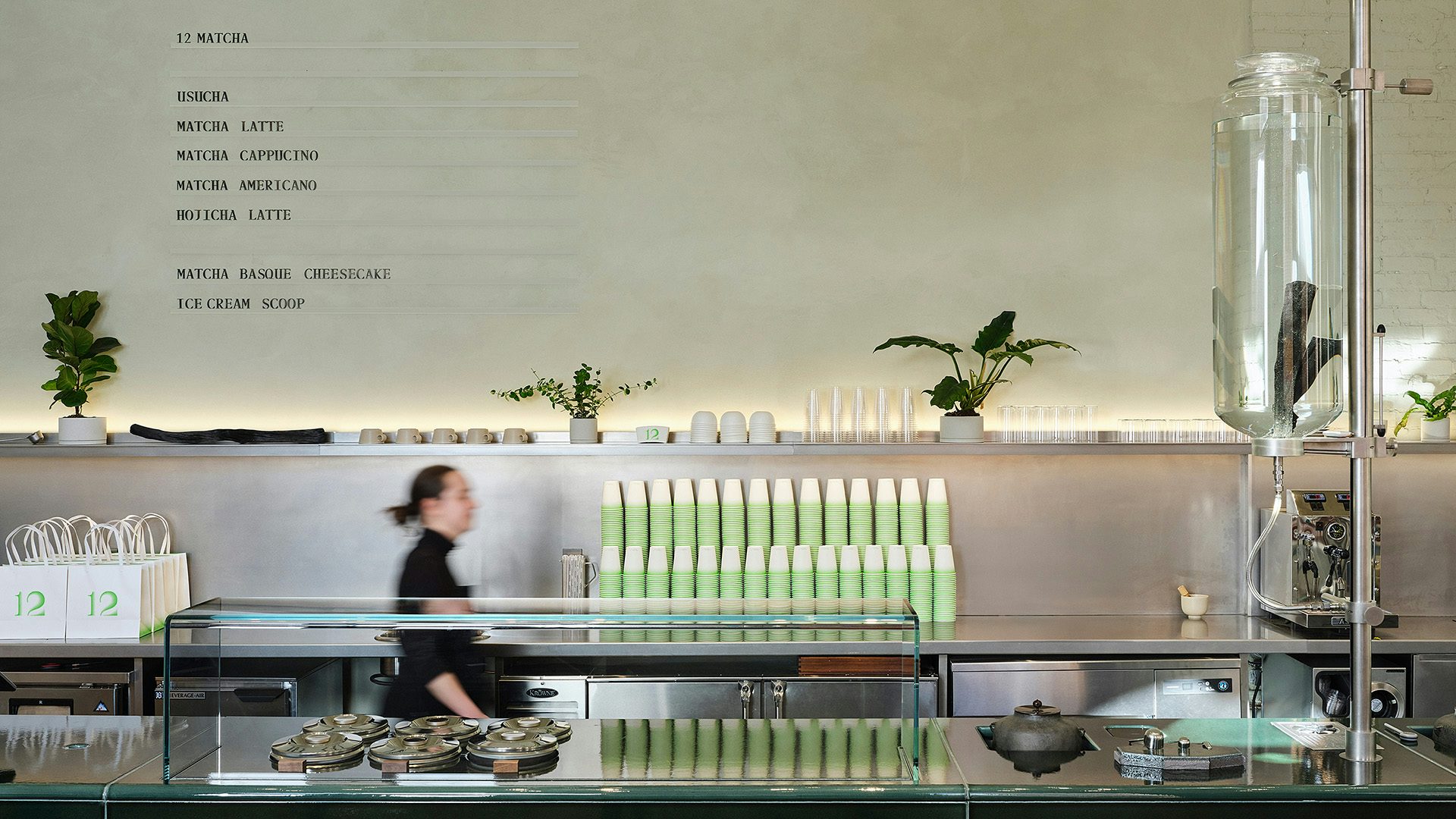
Base Design worked across everything from the naming, visual and verbal identities, to the Manhattan space designed by French architecture studio Ciguë that revolves around a tasting table. Unusually, the agency was even involved in the product development stage too, allowing the team to ensure consistency and seamlessness throughout the experience.
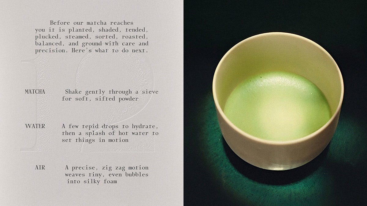
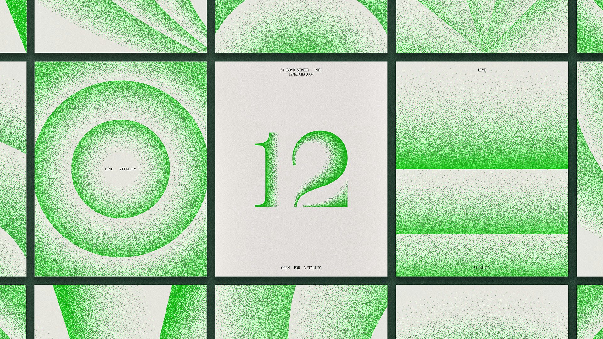
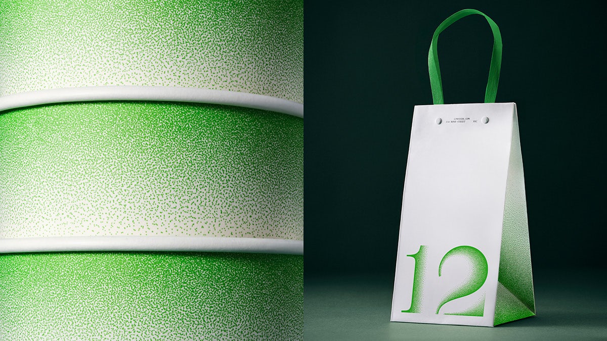
The brand is intended to create “a moment of calm, a reset, a way to bring vitality back into daily life”, according to Lew. These philosophies come through in the visual identity, with its soft, airbrush-style textures channelling matcha particles paired with a vibrant green palette. “The colour green is a relevant code in this space. However, 12 uses green more punctually with intentional use of white and white space to set the tone,” says Carlos Bocai, associate design director at Base Design.
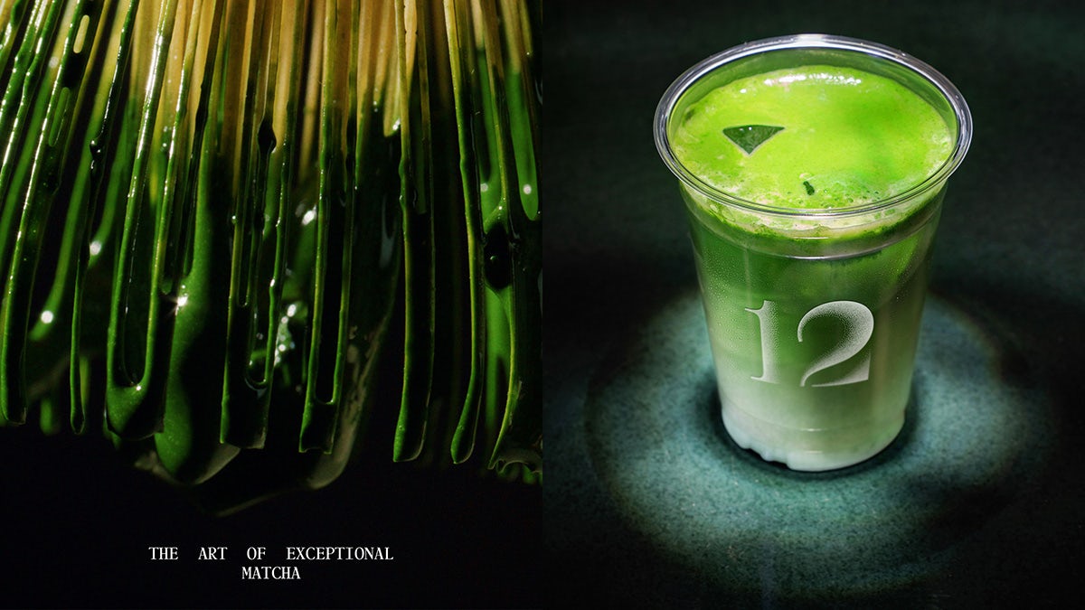
The search for a sense of calm also influenced the brand name itself, which references the natural rhythms of the astrological calendar as well as the 12-hertz brain frequency indicating a relaxed state.
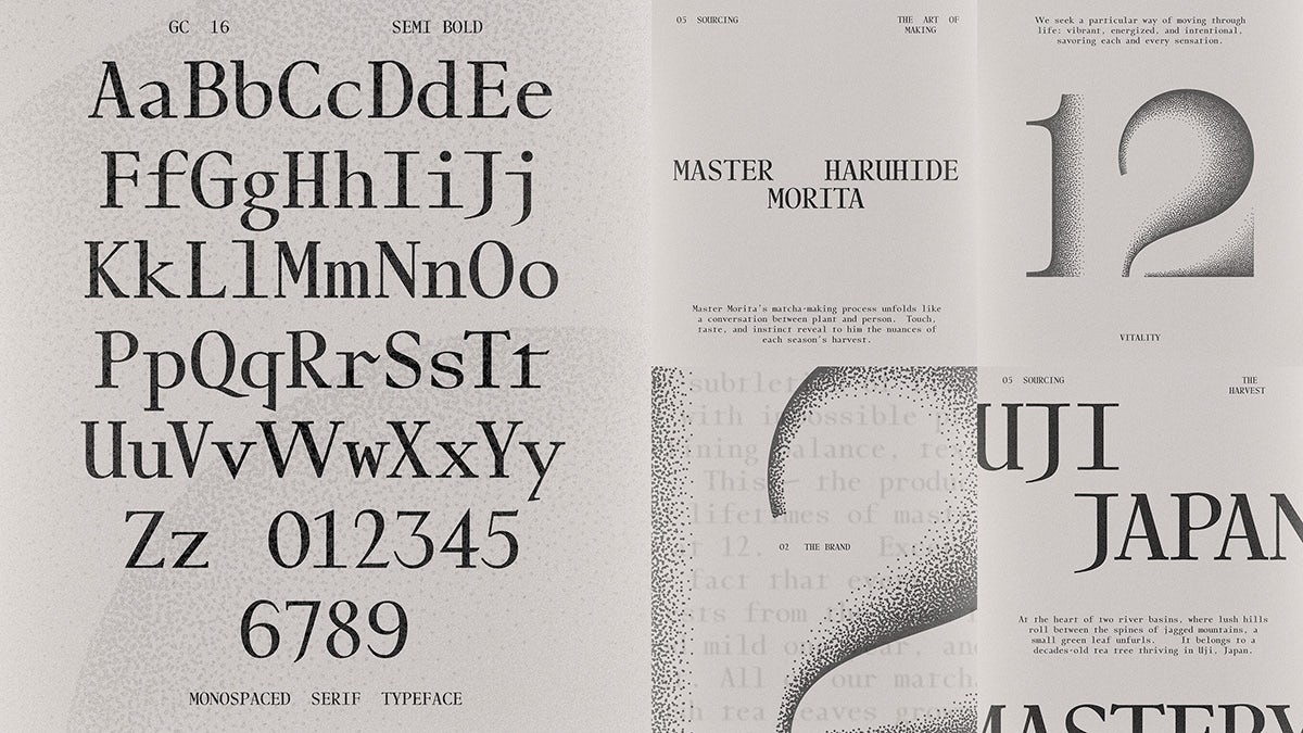
The monospace typeface chosen for the project, GC-16 by Bold Decisions, is a particularly charming choice, with its unusual serifs and other flourishes that create a hand-carved feel. “We saw that there was something about mixing these highly organic traits with something as ‘digital’ and unusual as a monospacing,” the foundry has previously said of the typeface.
The nods to analogue craft are balanced by contemporary moving image treatments, including an animated logo and graphics as well as technical visualisations. Together, they create a harmonious brand that feels at once traditional and fresh, subtle and distinctive – just like 12 promises to be.
