Founded in 2007, the music streaming platform Deezer has often been in the shadows of its main competitor Spotify. But with users in over 180 countries and almost 10 million subscribers, recently the platform has shifted towards a new brand purpose, defined as ‘Deezer helps you be and belong’. With that comes a new identity rooted in their belief that ‘Music is the beating heart of life’.
Bringing in design studio Koto to help, at the heart of the rebrand is a fresh logo that symbolises a beating heart. The logo aims to capture Deezer’s essence and draws from a few core ideas: love and passion for music, and instilling a sense of belonging in the Deezer experience. The logo has also been set in motion and pulsates to echo rhythms and beats.

Beyond the logo, Koto has adopted a motion-first approach with the rest of the design system further building on the beats element as well as playfully tapping into the rhythmic pulse of music. The beats take various forms to create dynamic patterns and graphic elements to help bring the identity to life. This offers Deezer flexibility by using these beats as illustrative elements, sound expressions, or container shapes for brand imagery.
“The core brief from Deezer was that they wanted to create a clear visual thread through their identity to link everything together,” says Koto creative director Joe Ling. “Now, our logo lead system just does that, with a clear visual connection between every brand element driven by the repeated use of the beats in the logo. ‘Live the music’ isn’t just a phrase; it’s the life force that courses through every aspect of Deezer’s new brand.”
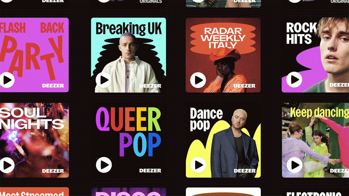
The notion of flexibility extends to the specially created Deezer Sans typeface, a variable font designed in collaboration with Luke Prowse, founder of NaN type foundry. The shapes within Deezer Sans are informed by those found in the brand’s logo, and with various weights available it can be applied in a range of ways such as playlist covers and marketing materials.
To further brighten the new identity, a fresh colour palette has also been introduced. A vibrant Deezer Purple is the focal hue, and the supporting colours, including red, blue and green, add contrast, along with black and white.

koto.studio